
Okay okay – remember Mesa K-8 School? Claro que sí (of course). Well, this week we just wrapped up our brand design, and I truly mean it when I say I am so PUMPED to share this.
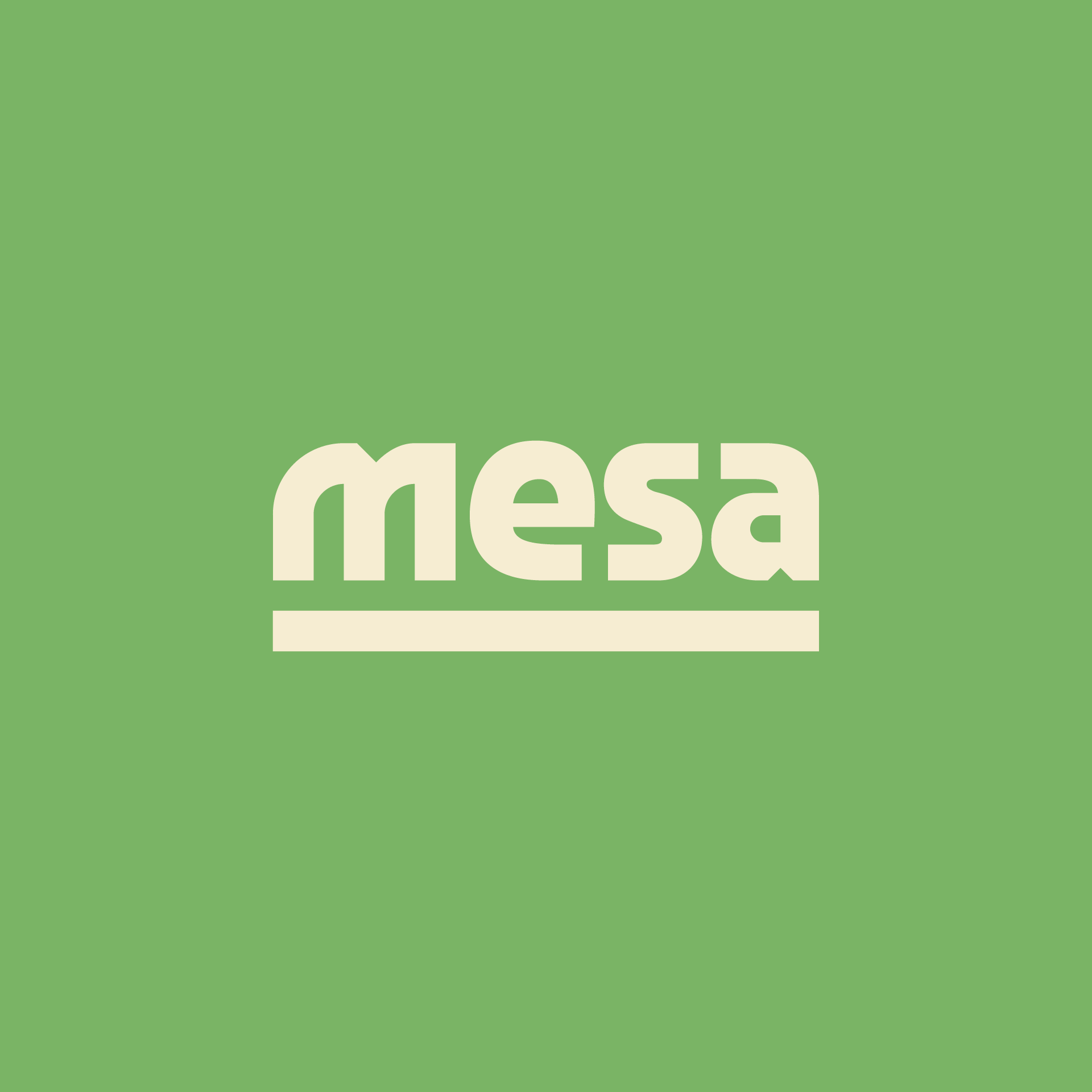
Here’s our wordmark to start. It’s simple, but let me explain what makes it special…
M: atypical because it leans right – shaped similar to a paw & claws (the school mascot is a mountain lion)
E: about as friendly as the letter E gets – it almost looks like it’s smiling
S: zigzag shape feels Mesoamerican – the school embraces its neighborhood’s latin roots
A: mirrors our letter M and the diamond notch gives us some flavor
Underline: representative of the school’s name (Mesa/table) and ideology – here, everyone has a seat at the table
Hasta pronto – more to come…