Let’s get nerdy about typography.
“Wait, can’t you just open up word and type that out?”
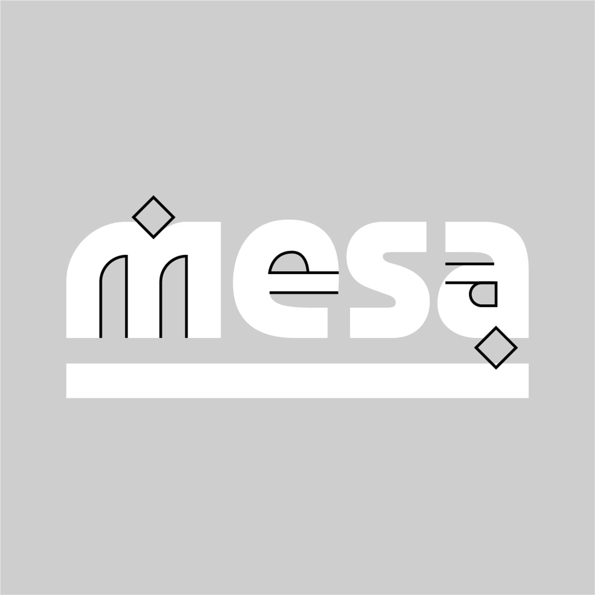
The customization behind our MESA wordmark, explained:
– completely new M. As the leading letter, this is where our identity shines – lightly shaped like a mountain lion’s paw and claws.
– diamond-shaped notch applied to both M and A. Feels Mesoamerican – the school embraces its neighborhood’s latin roots.
– increased size of the counters inside E and A to make it easier to read from a distance (counter is the space inside of a letter).
– our S, yes, is also customized, but hardly noticeable, so we won’t mention that.