Every so often, a client comes along with an existing idea that’s already super awesome – we just have to refine it.
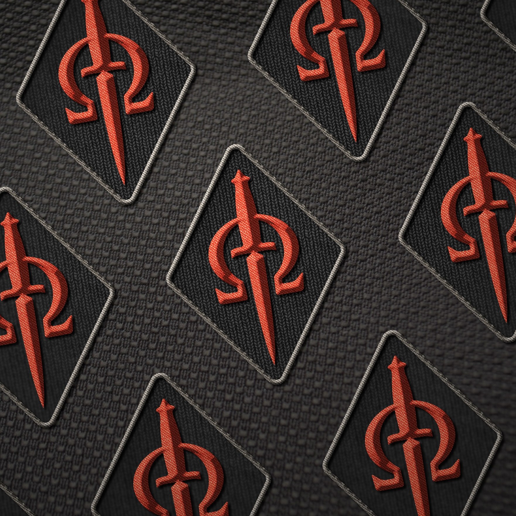
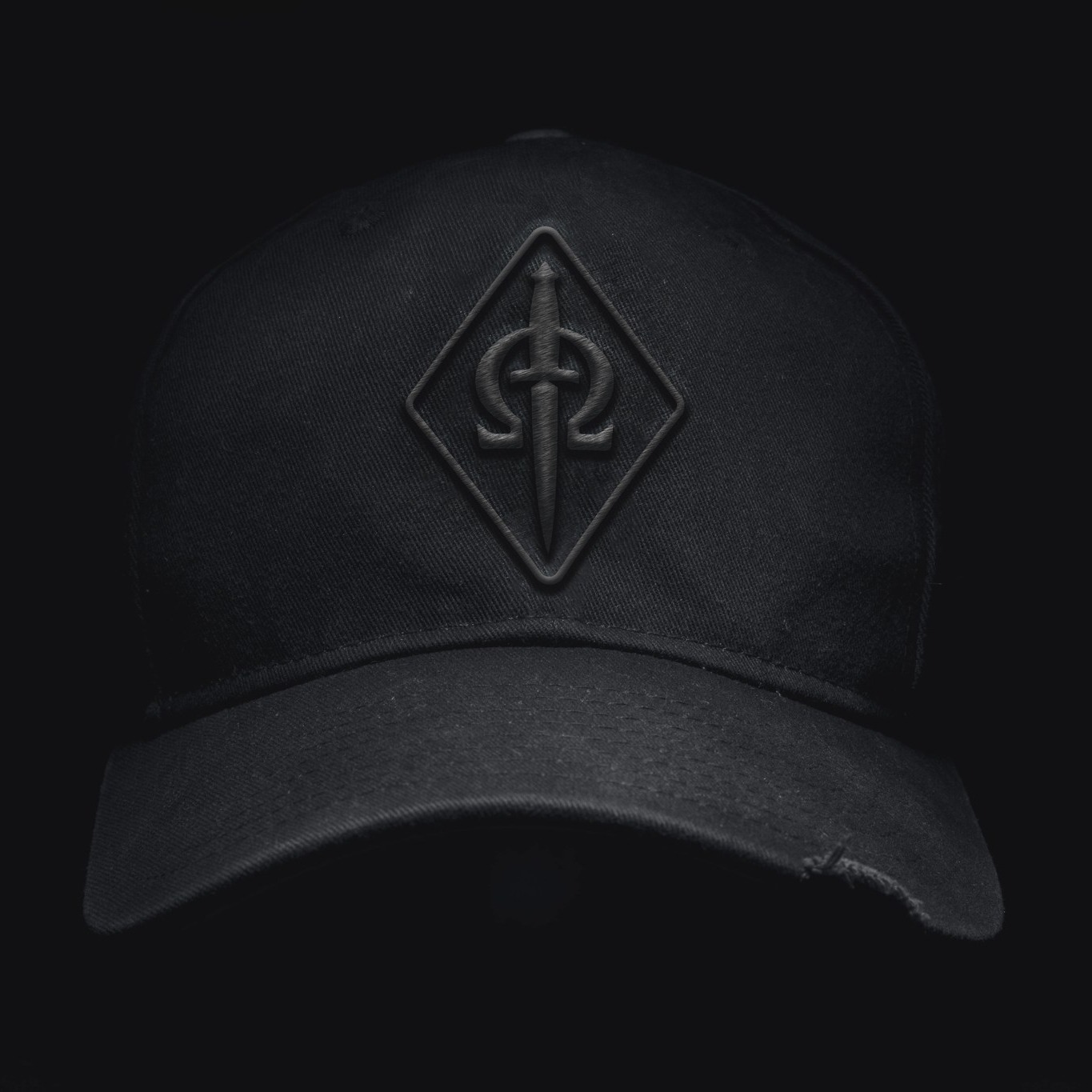
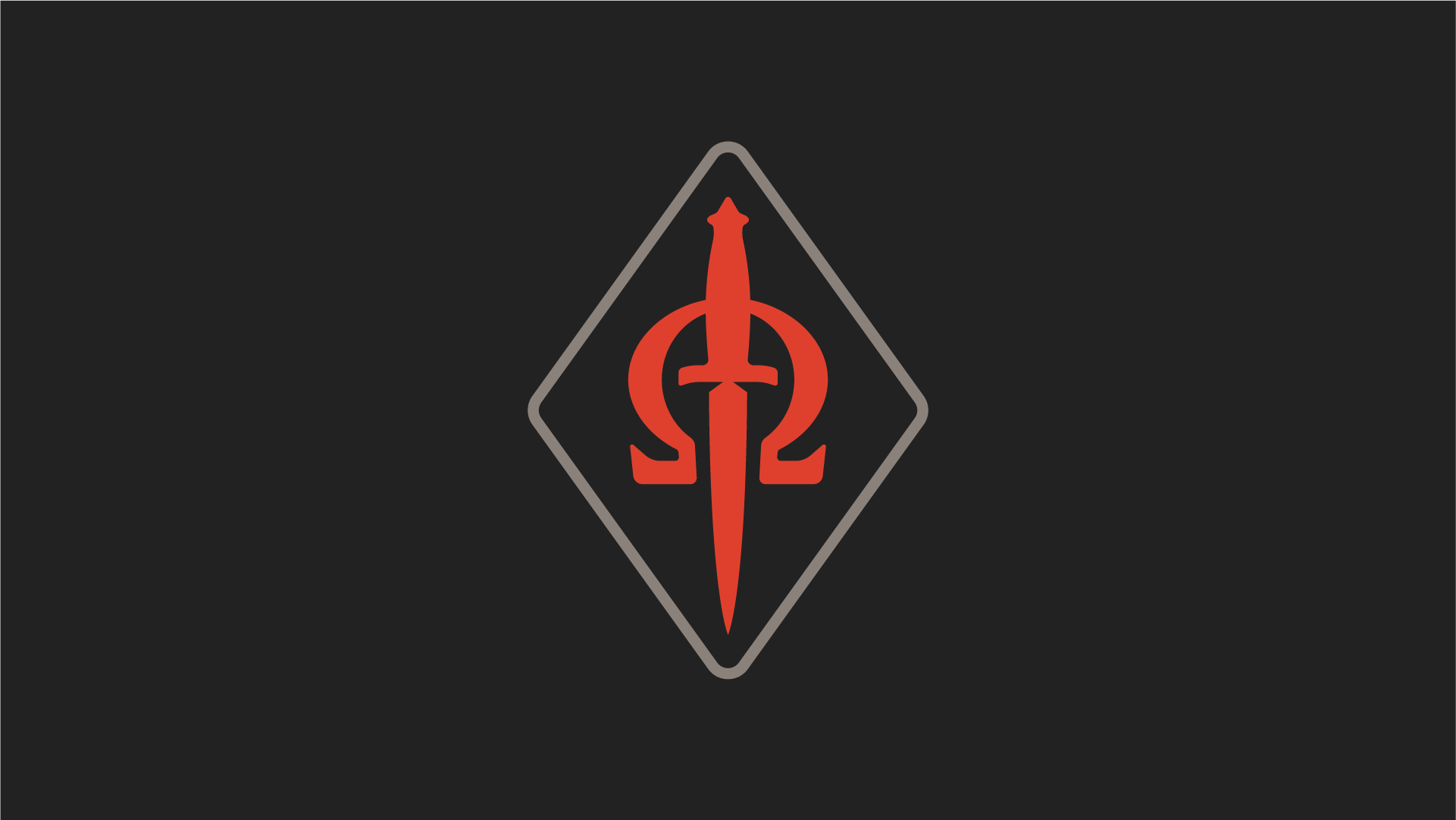
I love the balance they struck with the two elements overlapping. Together we created a more realistic looking dagger, exaggerated our negative space, and built an omega symbol with extra contrast. The result is an all-time design that will work well embroidered.


