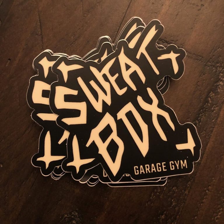
After a long Summer sabbatical, its nice to get back into the saddle of design with a quick and dirty branding project for my friend Zack Thompson and his garage gym. This logo and word mark is intentionally haphazard lending itself to the gym’s intense and unpredictable style. The icon symbolism goes a step further: X marks the spot. As always, this logo design is vector based with clean lines built in Adobe Illustrator. No brand is complete without Pantone colors – this one has them.
