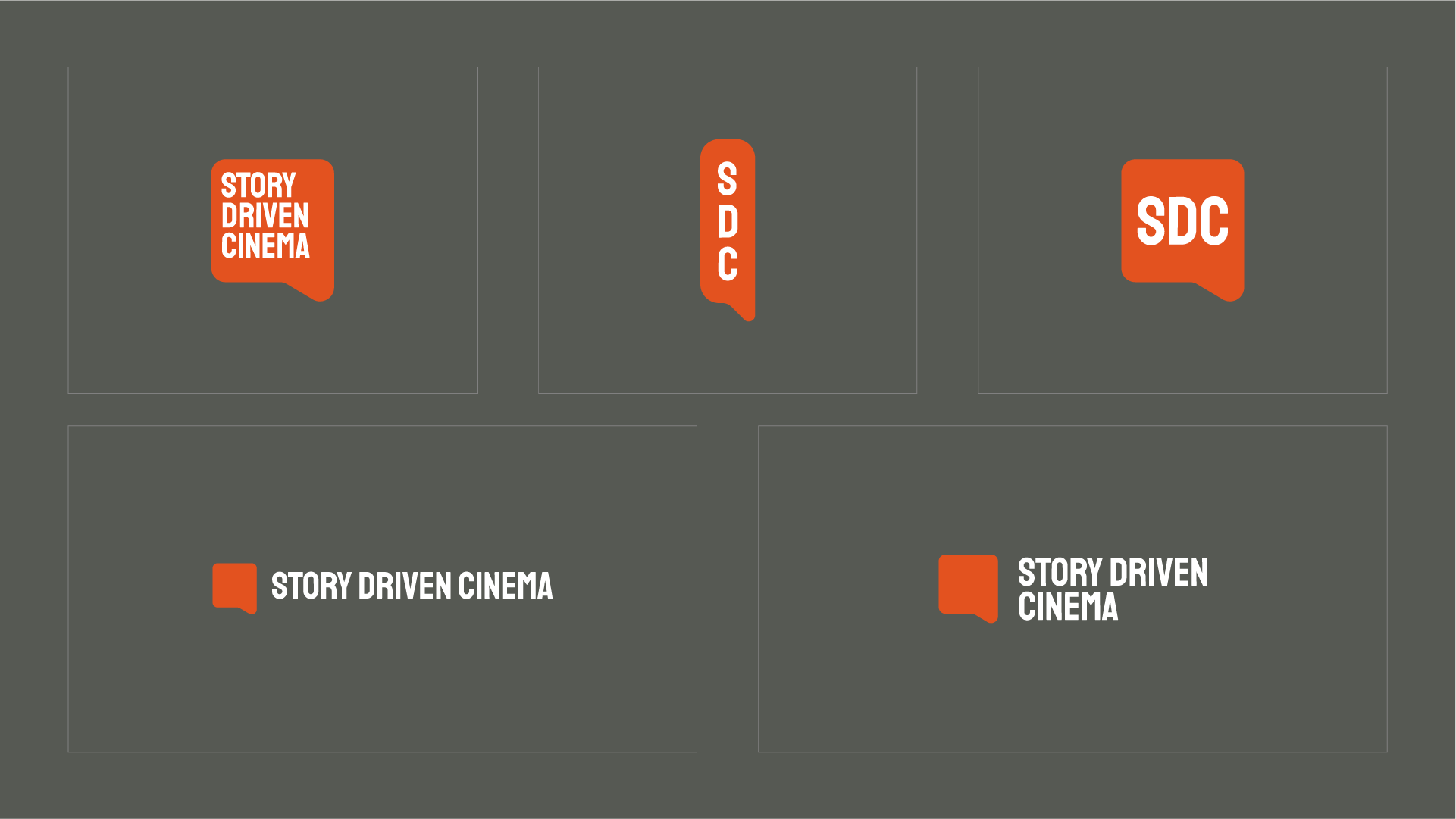
A logo is much more than a singular mark. Here’s a great example from the Story-Driven Cinema project where the same design can take different forms based on different situations.
1. Main logo: our go-to mark that builds name recognition.
2. Vertical abbreviation: a non-standard mark used in special situations where an elongated design fits best.
3. Abbreviation: a frequently used shorthand mark used in situations where our name is already known or the logo is displayed small.
4. Wordmark: ideal for a website header or other situations where we are working in a horizontal space.
5. Wordmark stacked: a more condensed wordmark that works well paired with other media.
