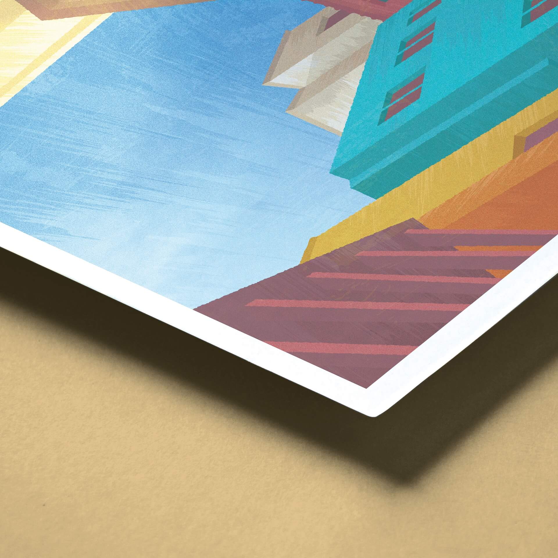
A follow-up here with the Visita Guanajuato poster: I wanted to show off some of the more nuanced texture, an aspect I’m really proud of!
For my AI nerds, here’s how the technique went down…
– copy and paste shape
– make above shape darker or lighter
– make mask
– place a charcoal brush line within mask
– increase line weight to stretch brush horizontally to a ridiculous degree (that’s the texture effect)
– angle the line perpendicular to the direction I wanted the texture
– cap it off with a roughen distort & grain layer
