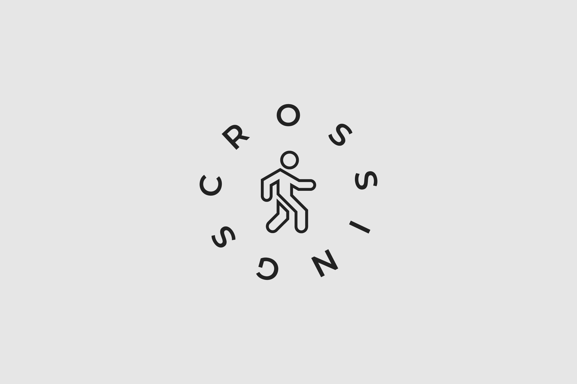
Yesterday, I revealed some draft designs for Chicago street wear brand, Crossings. Not included was this alternate ‘walkman’ design. In step with their main logo, the walkman mark gives the Crossing brand a nice alternate look.
The figure in the center is a loose representation of the crossing figure in walk signs. Large C-R-O-S-S-I-N-G-S letters in a circle around the outside give the logo a nice balanced appearance.
