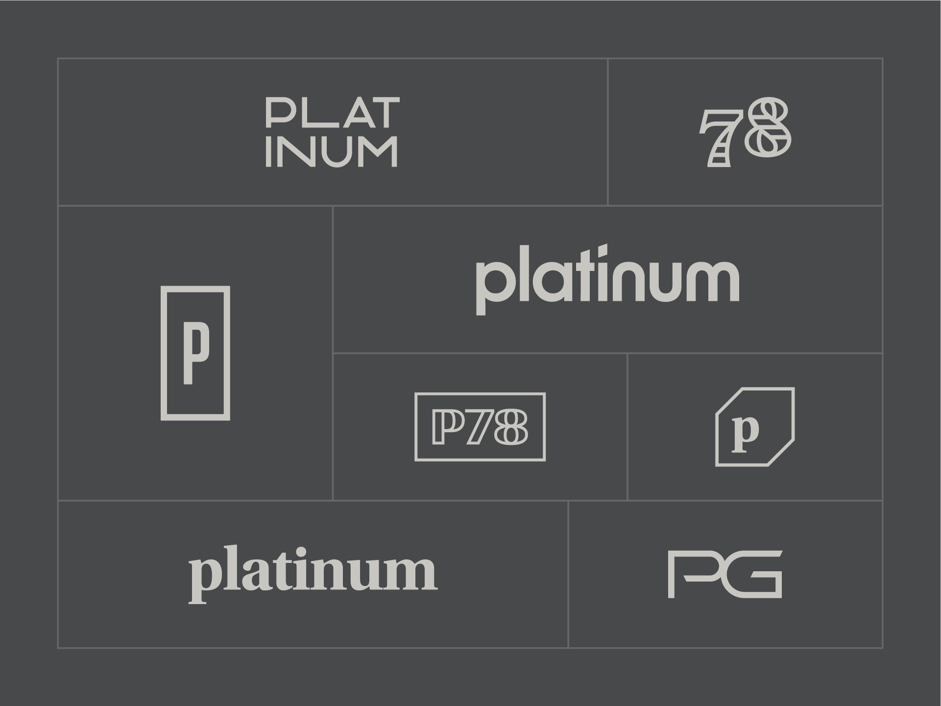
Platinum Group Logo Ideas
Last year, I made an adjustment to my logo process to become more prolific. I still start the project with
Last year, I made an adjustment to my logo process to become more prolific. I still start the project with
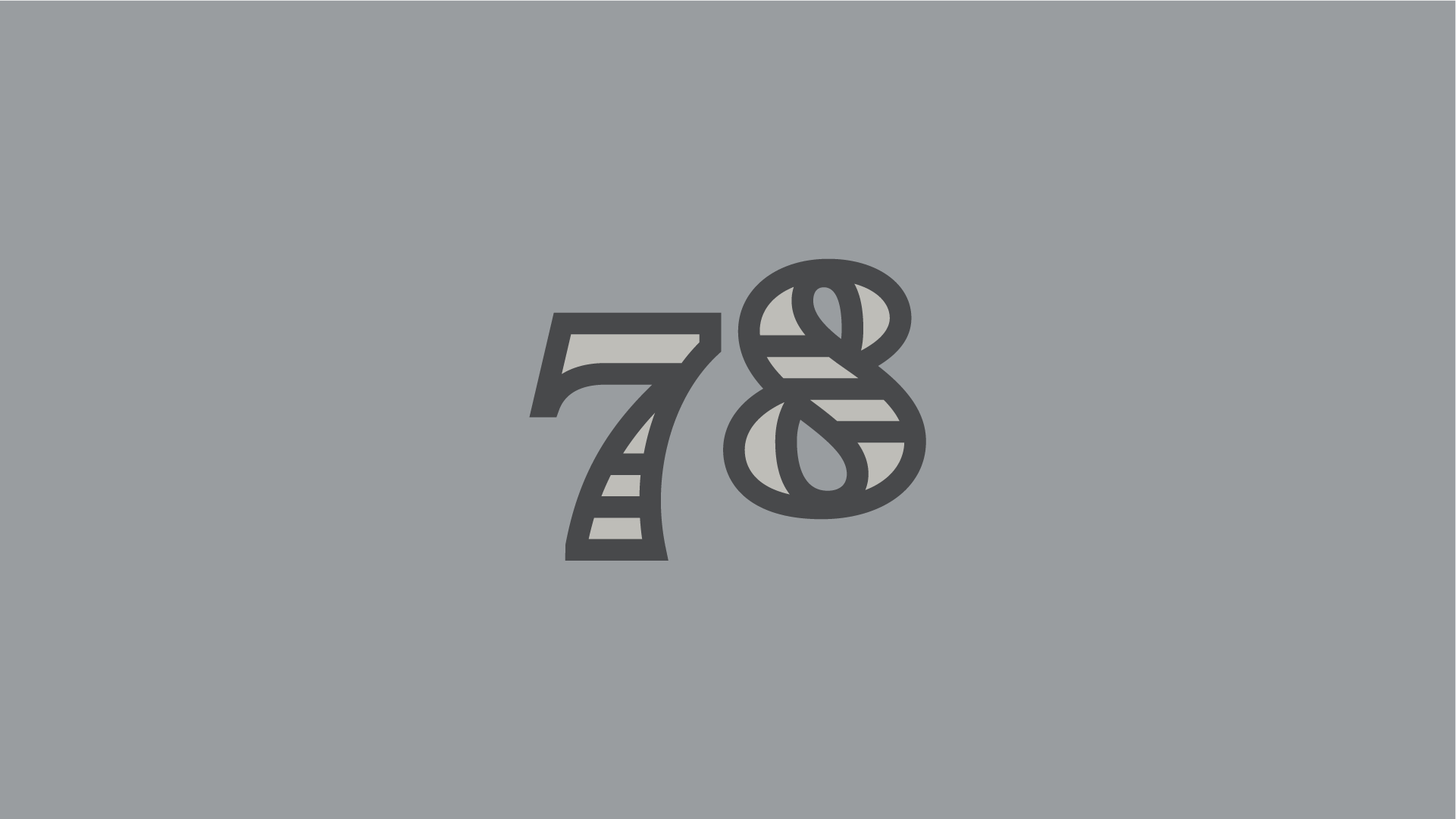
There could be a joke here about that time seven ate nine, but I ten to avoid such cheesy puns.
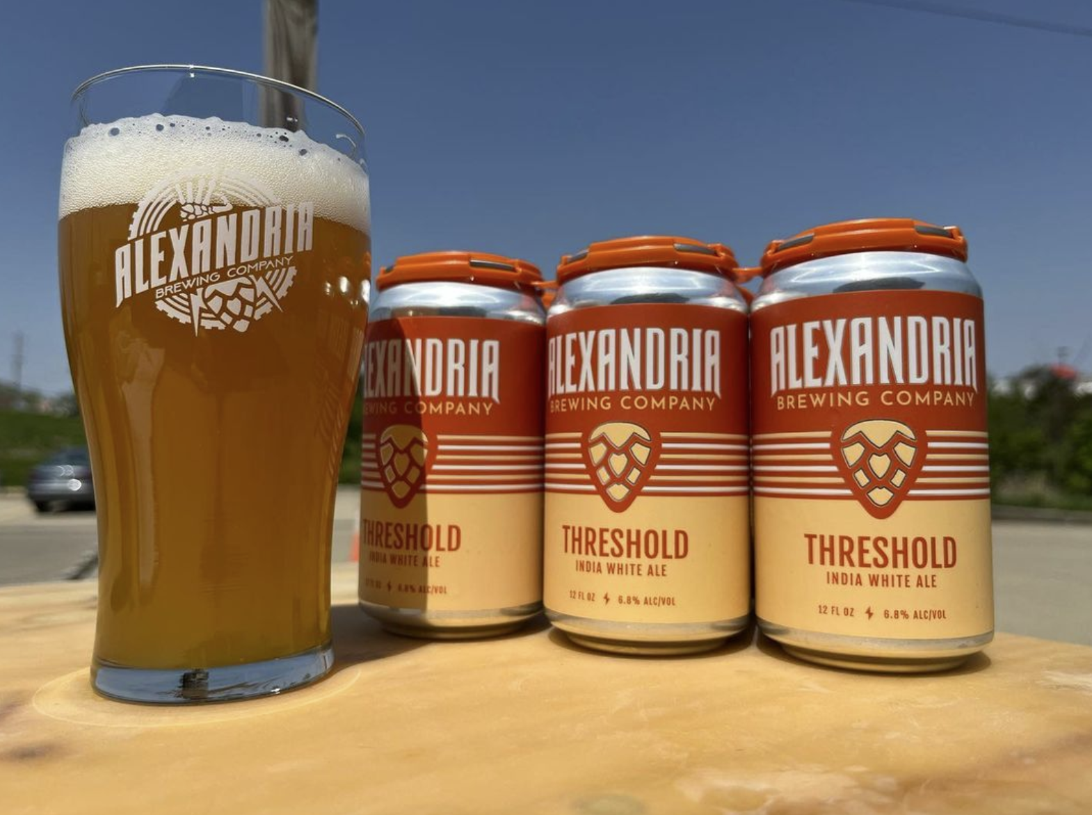
It’s that time of year – Summer is around the corner, and I’m going to shamelessly repost one of Alexandria
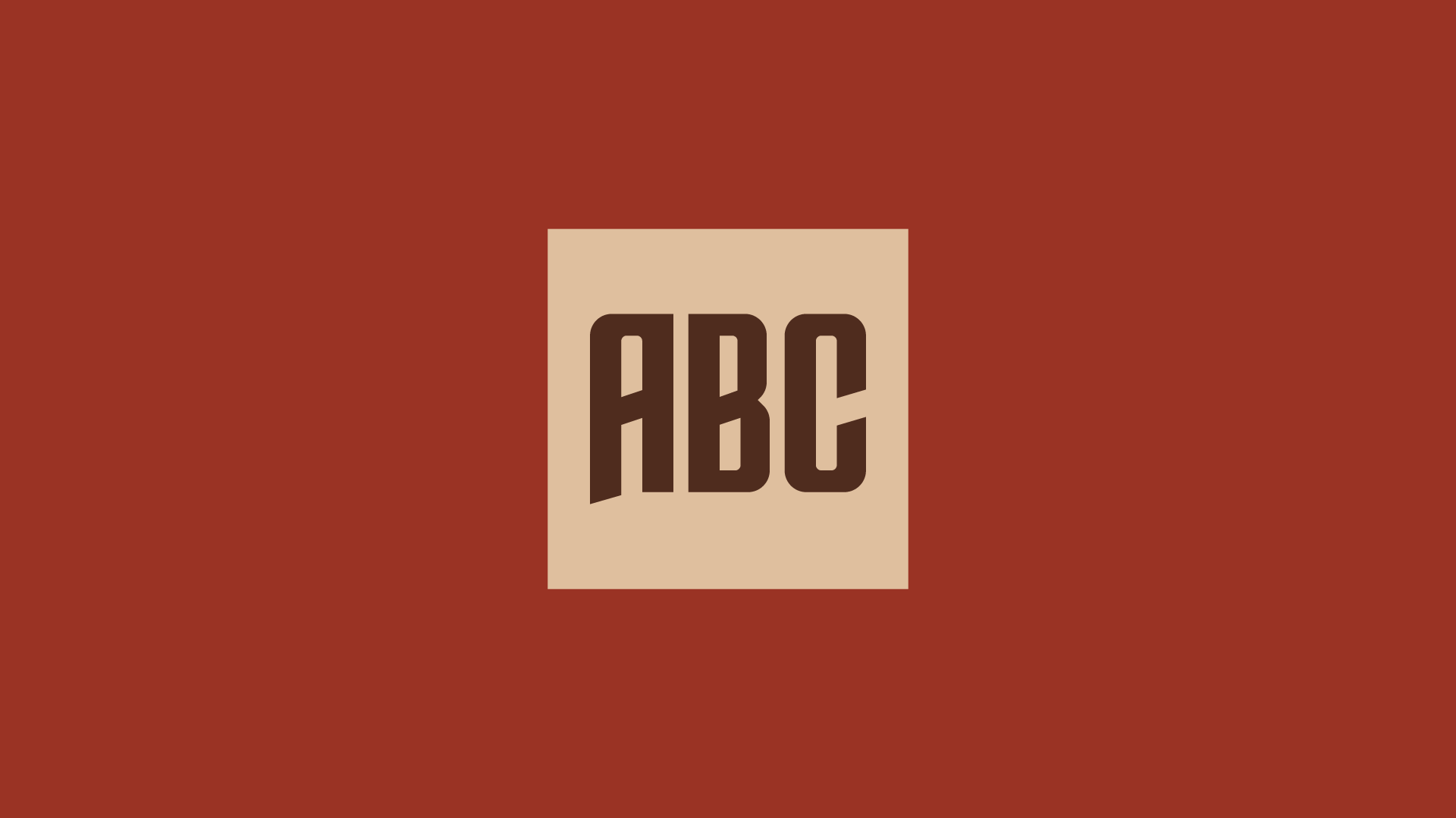
Good brands evolve. This ABC monogram was created for Alexandria Brewing Company a few years back – it was cool,
A sweater mockup to seal the deal. Background: World Wide Will, also known as Captain WWW or simply Will McCabe,
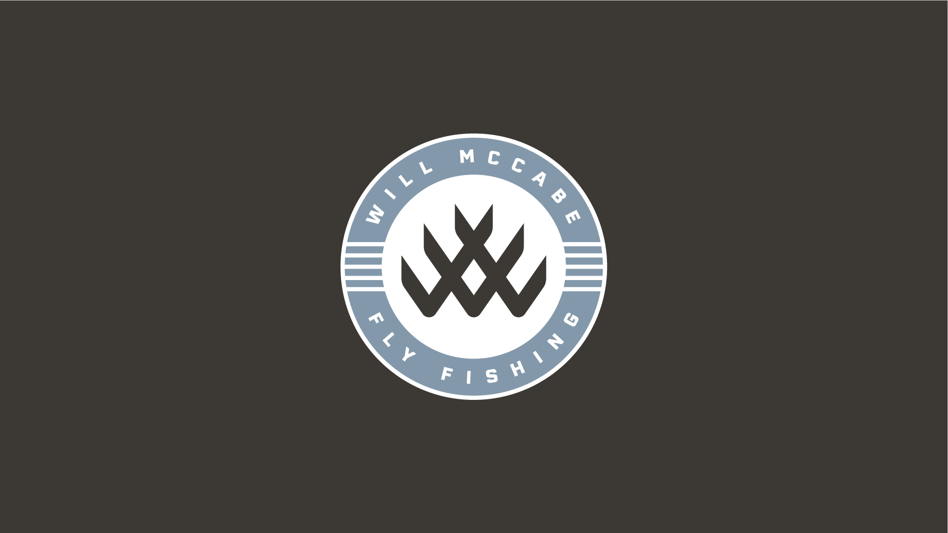
The name is World Wide Will, or simply ‘WWW’. This is one of those projects where everything clicked. As soon
Introducing… (extended drumroll). In an industry with some wild packaging, we went clean & flexible. The idea here is that
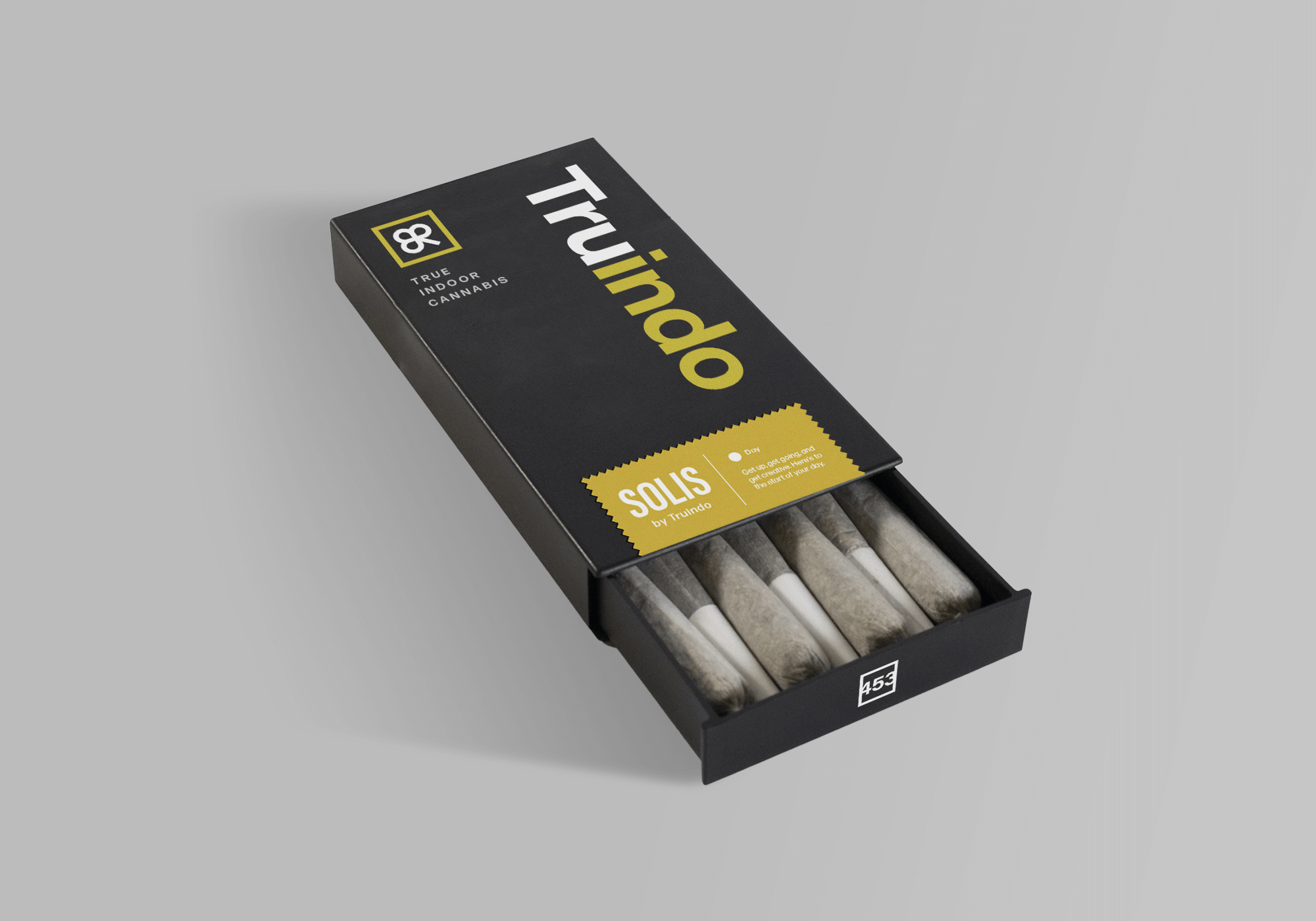
A complimentary mark for the Truindo I almost left us hanging! Here’s the capstone to our Truindo project, the coveted pre-roll
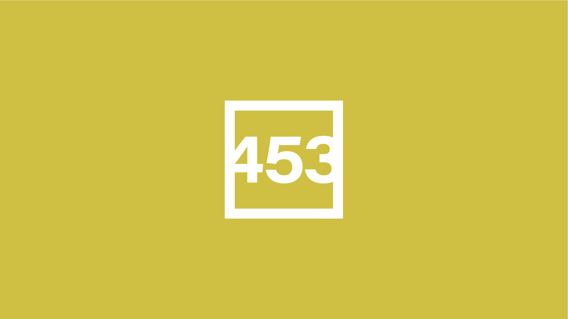
A complimentary mark for the Truindo brand! But why, 453? That’s the true amount of kilograms in a pound (.453),
Truindo went clean with this selection! A few folks commented on the last post saying they liked the clover as
Which design would you choose? Background: Truindo is a premium pre-roll cannabis concept. ‘Indo’ meaning indoor, and ‘Tru’ meaning grown
It’s never too late to change. Back in 2018, I created this brand while interning with Motivate Creative under Dave
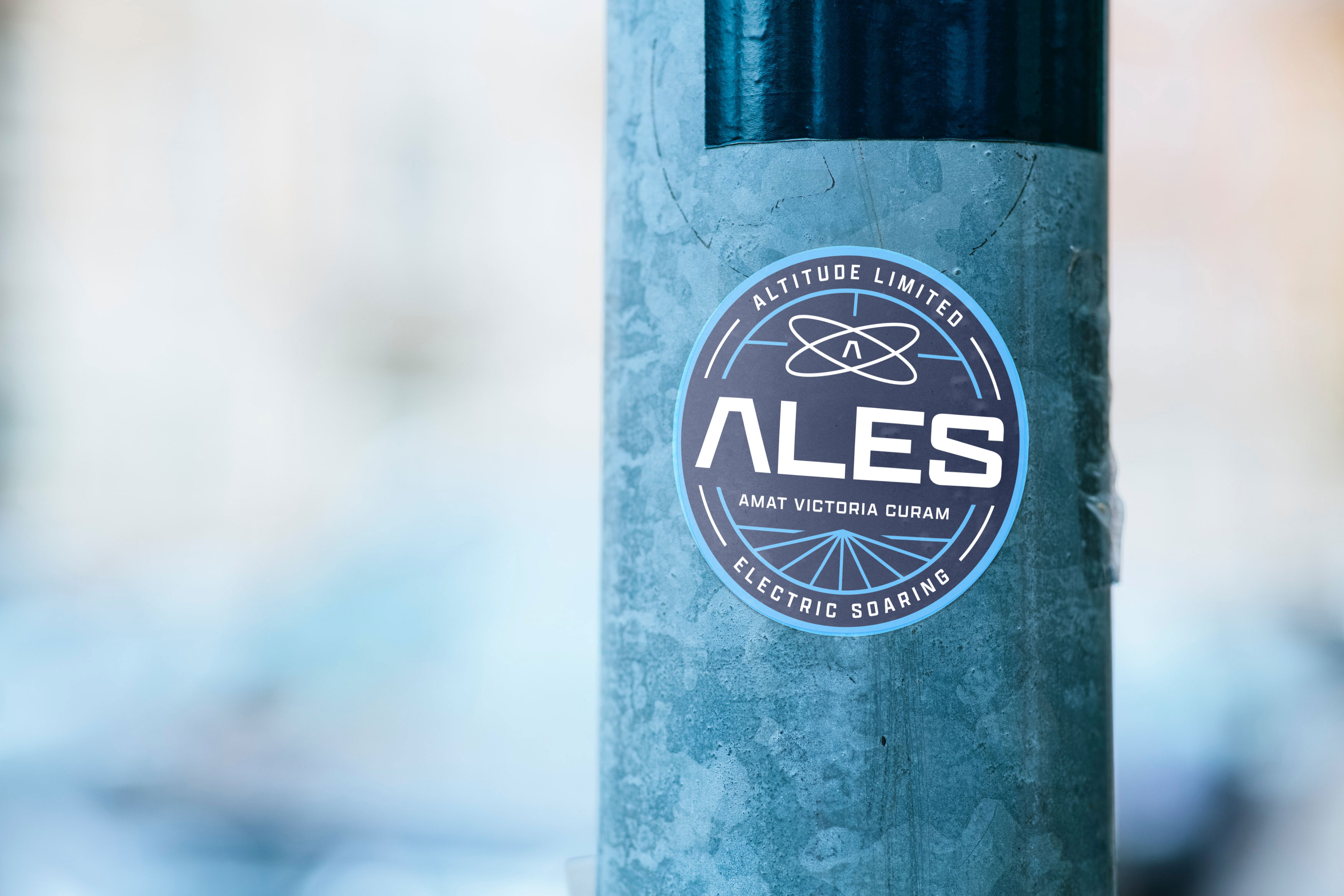
Here’s one more look at ALES in sticker form. This is a bit of personal behind the scenes discussion, but
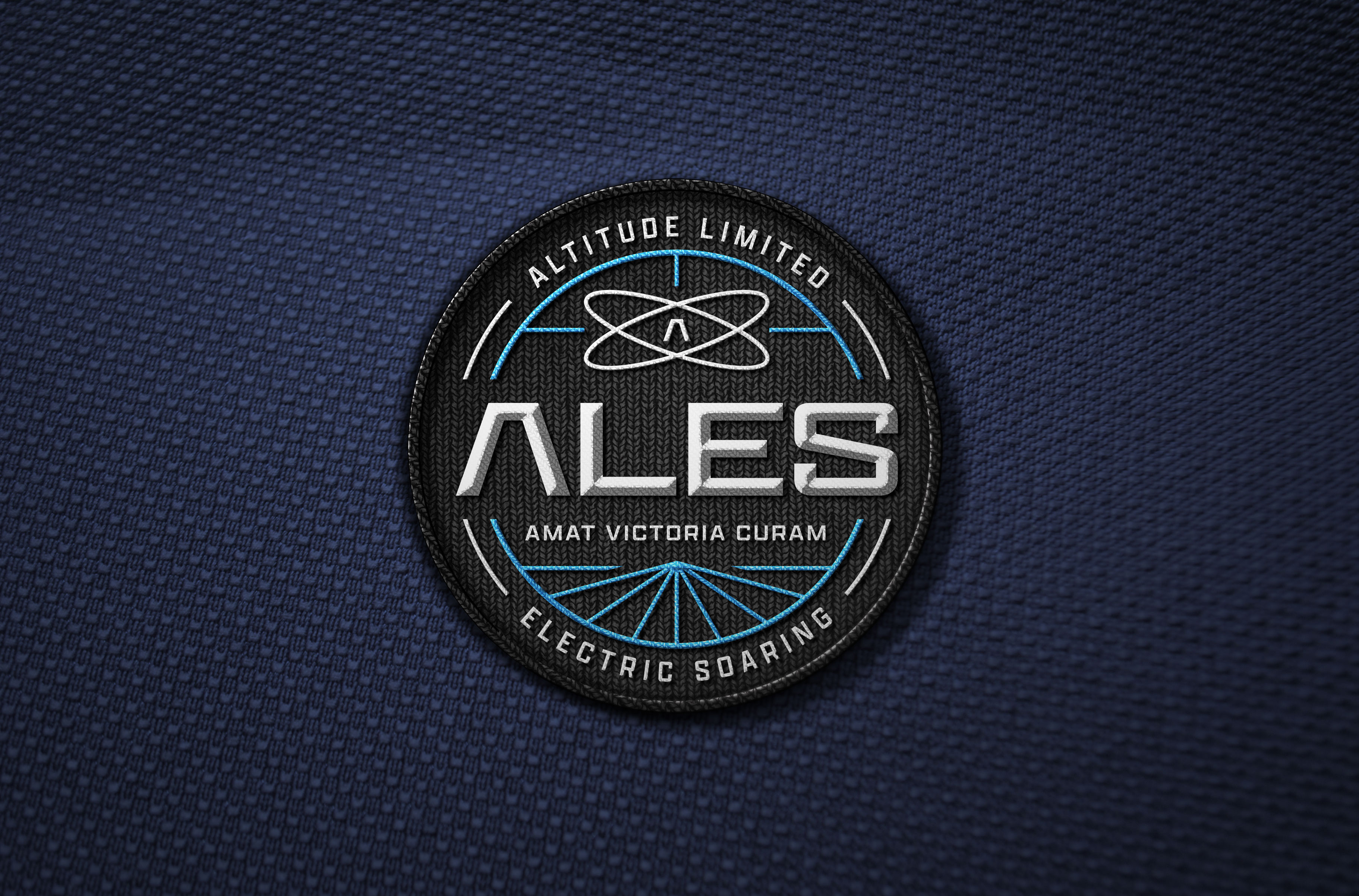
Ready for flight! We really like the ALES logo design in patch form. Especially dressed in a space-black background.
Here’s another design derived from the original ALES badge. It looks simple – but those overlapping shadows on the orbits
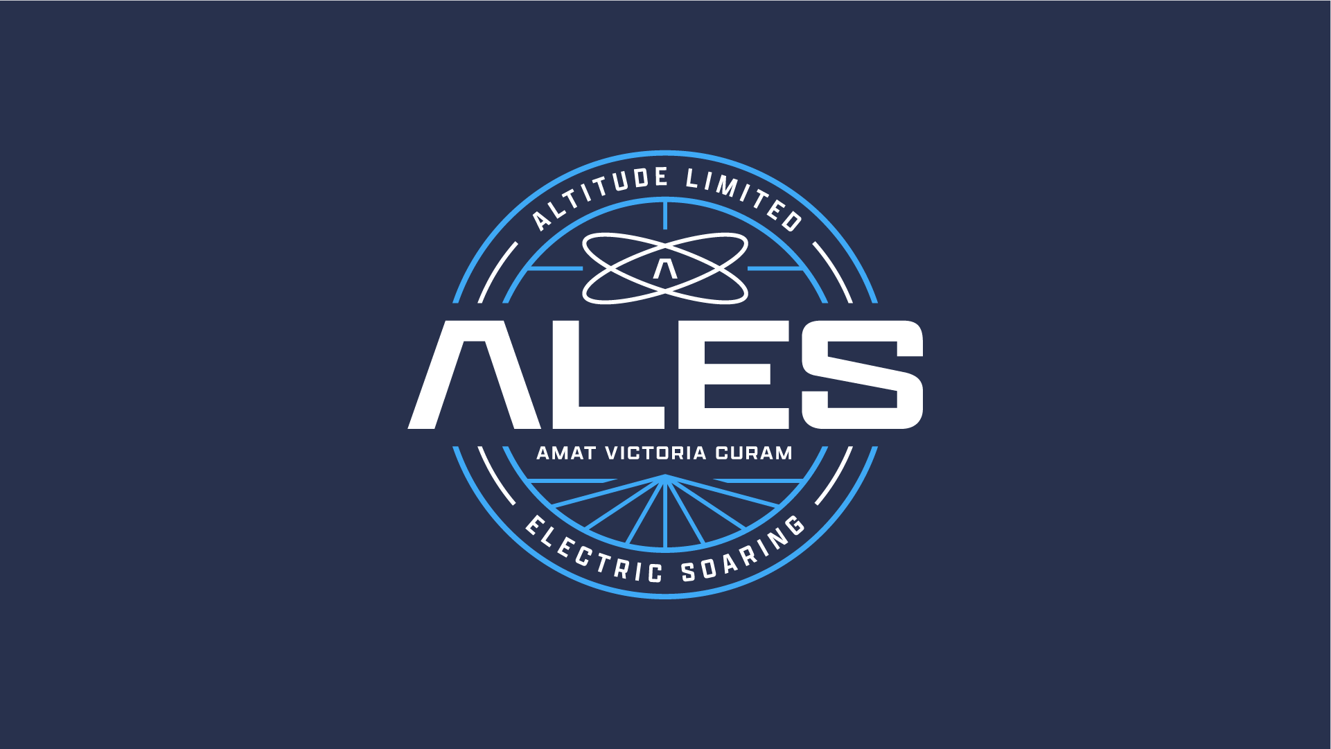
Badge? Crest? Seal? All terms we might use for a logo that’s intentionally extra complicated. ALES will get a ton
Style breaker! I teamed up with @shipwreckbarbershop to create something you’d never expect from me, a wordmark that is neither