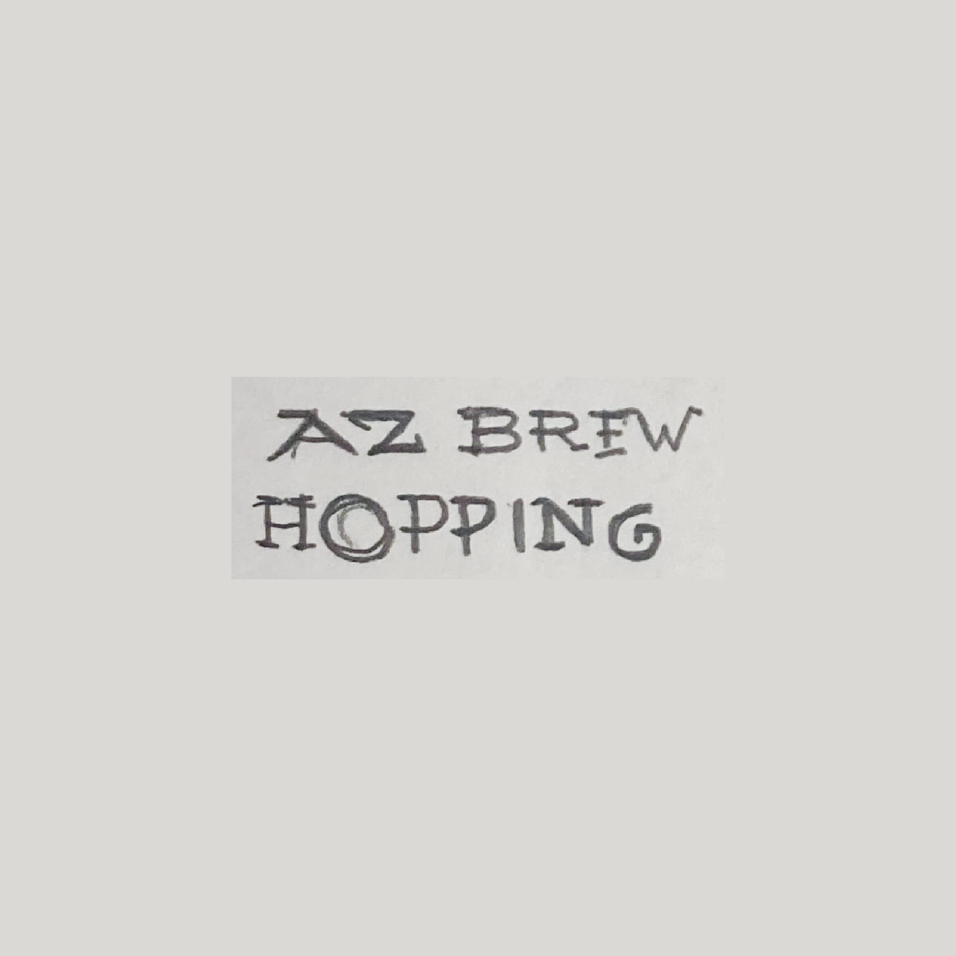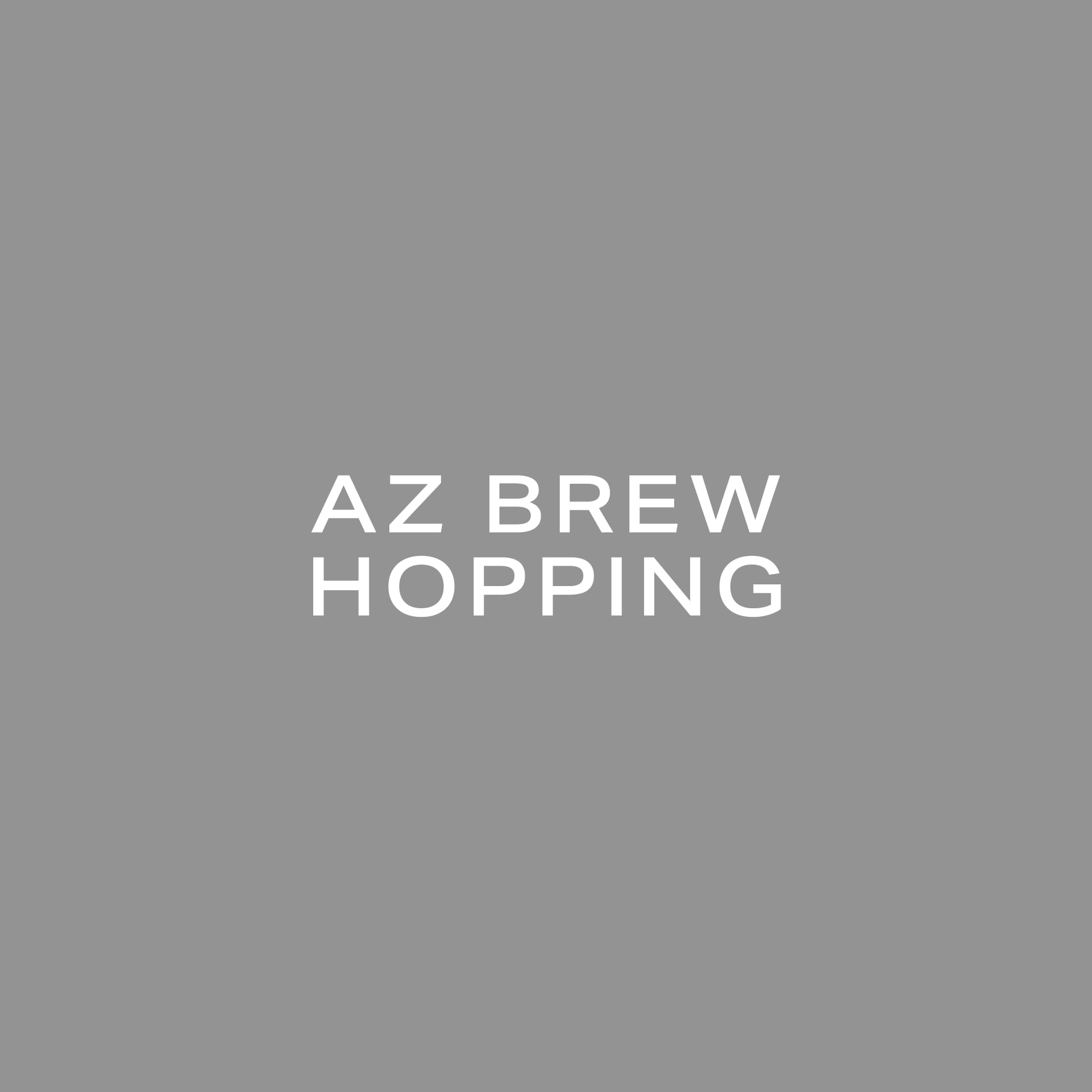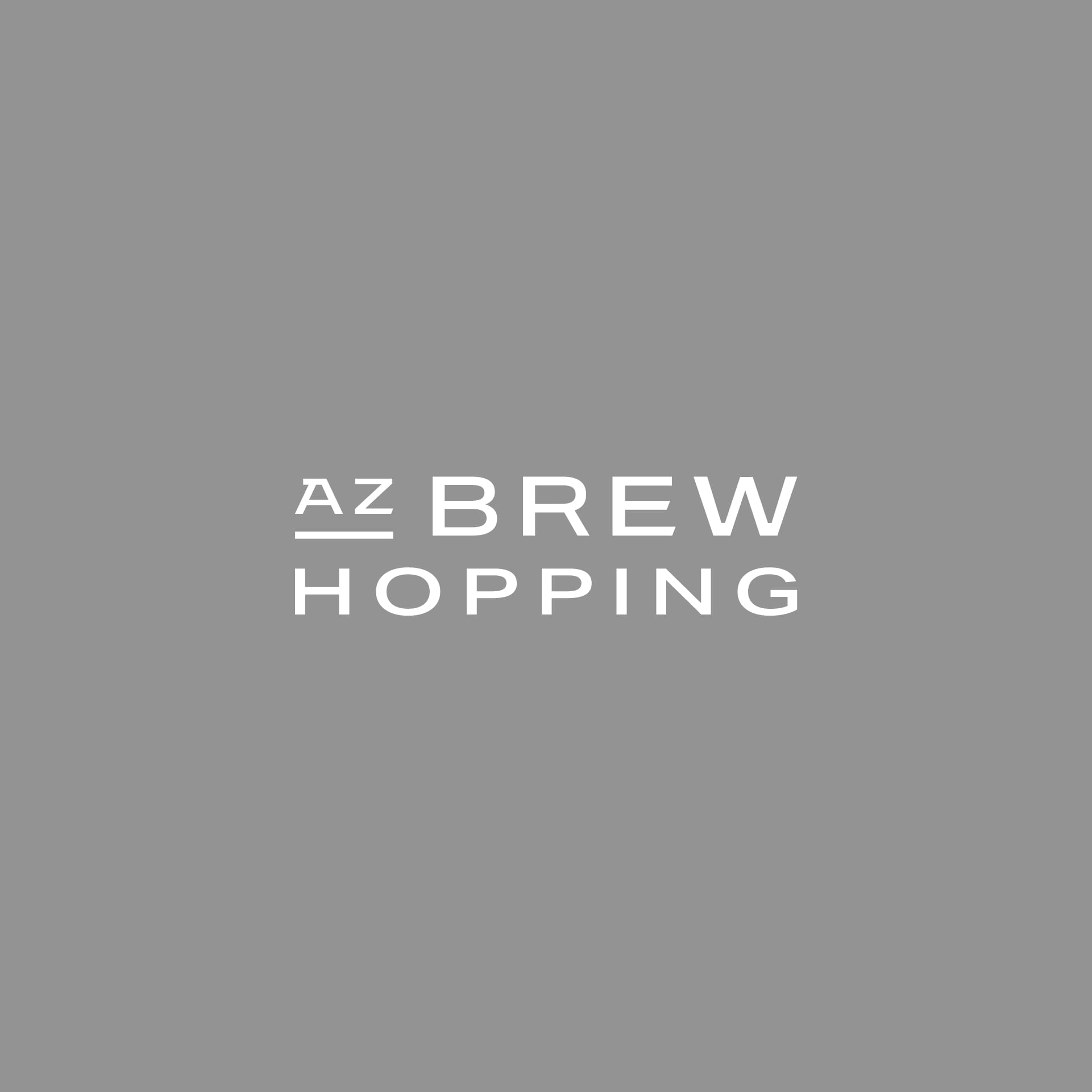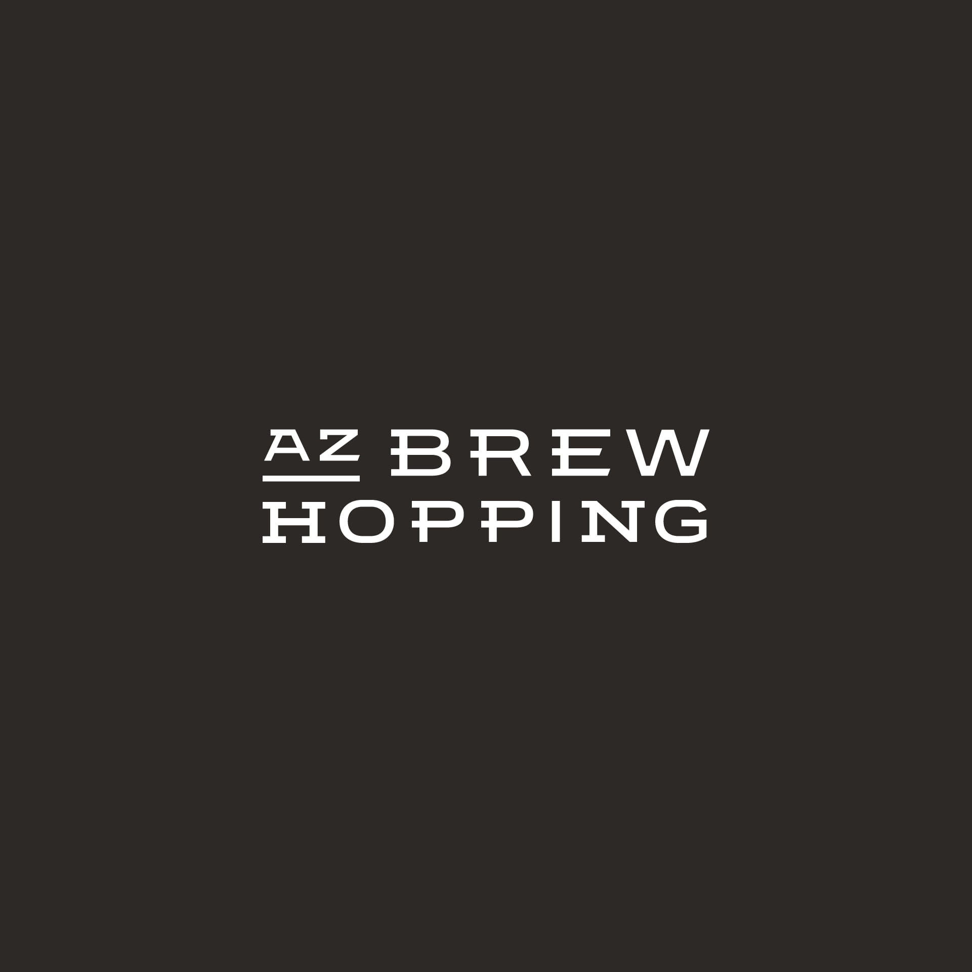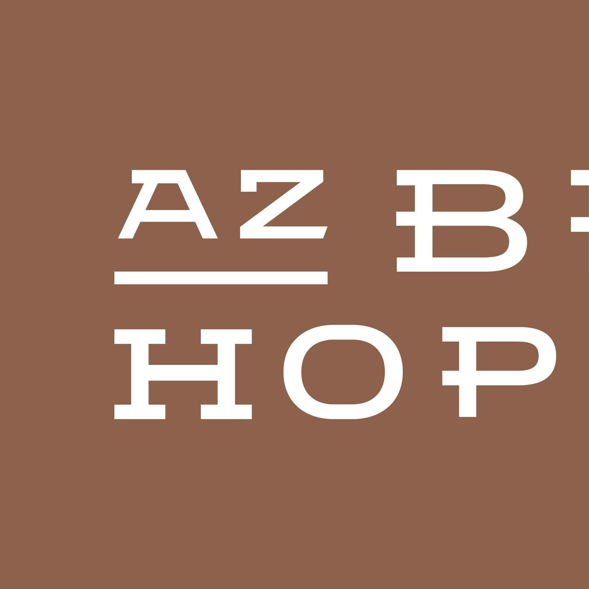
I’m especially fond of a logo like AZ Brew Hopping because of its custom typography. The result is simple, but a ton of thought went behind each character and how it should be stylized (or intentionally not stylized). Here’s a general progression of how we got there, A to Z.