Day six: we’re nearing the end of “Anatomy of a Logo”, a seven day series exploring some of my best geometry-based logo designs from this past year
Although this nature icon never came to fruition, the underlying shapes are too good not to share:
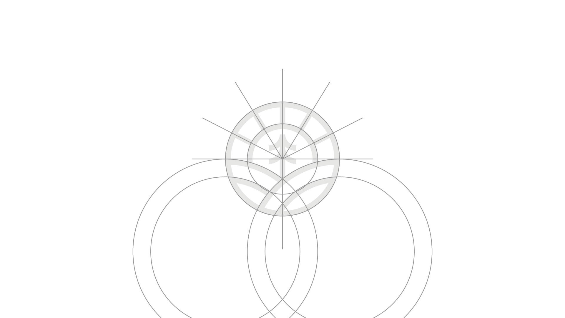
- Several circles form the foundation of the logo bringing shape to the container, hills, and tree branches.
- X and Y axes set the design on a grid. Key here is the alignment of the lower circles touching the X axis.
- Sun rays share angles at 30, 60, 300, and 330 degrees.

