Thanks for tuning into day five “Anatomy of a Logo”, a seven day series examining some of my favorite designs from 2019 rooted in geometry.
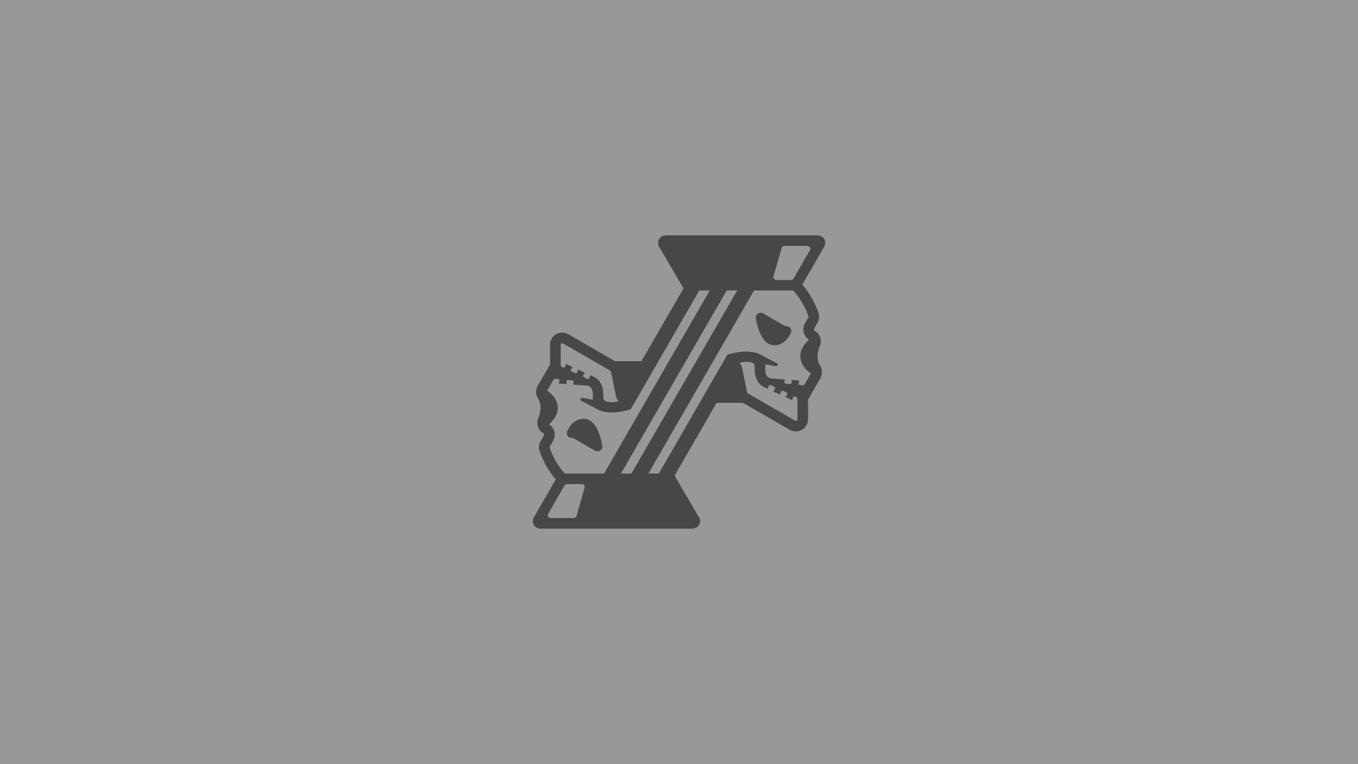
For a logo that feels more organic and illustrative, the Bravo Company Blackjacks stays mostly true to an underlying system of angles. Most shapes here have a relationship to standardized angles at 0, 15, 30, 45, 60, and so on. This attention to geometry helped us achieve a balanced look, a nod to the shape driven illustrations found on playing cards.

