Today I am launching “Anatomy of a Logo”, a seven day series revisiting some of my more geometrically compelling designs from 2019.
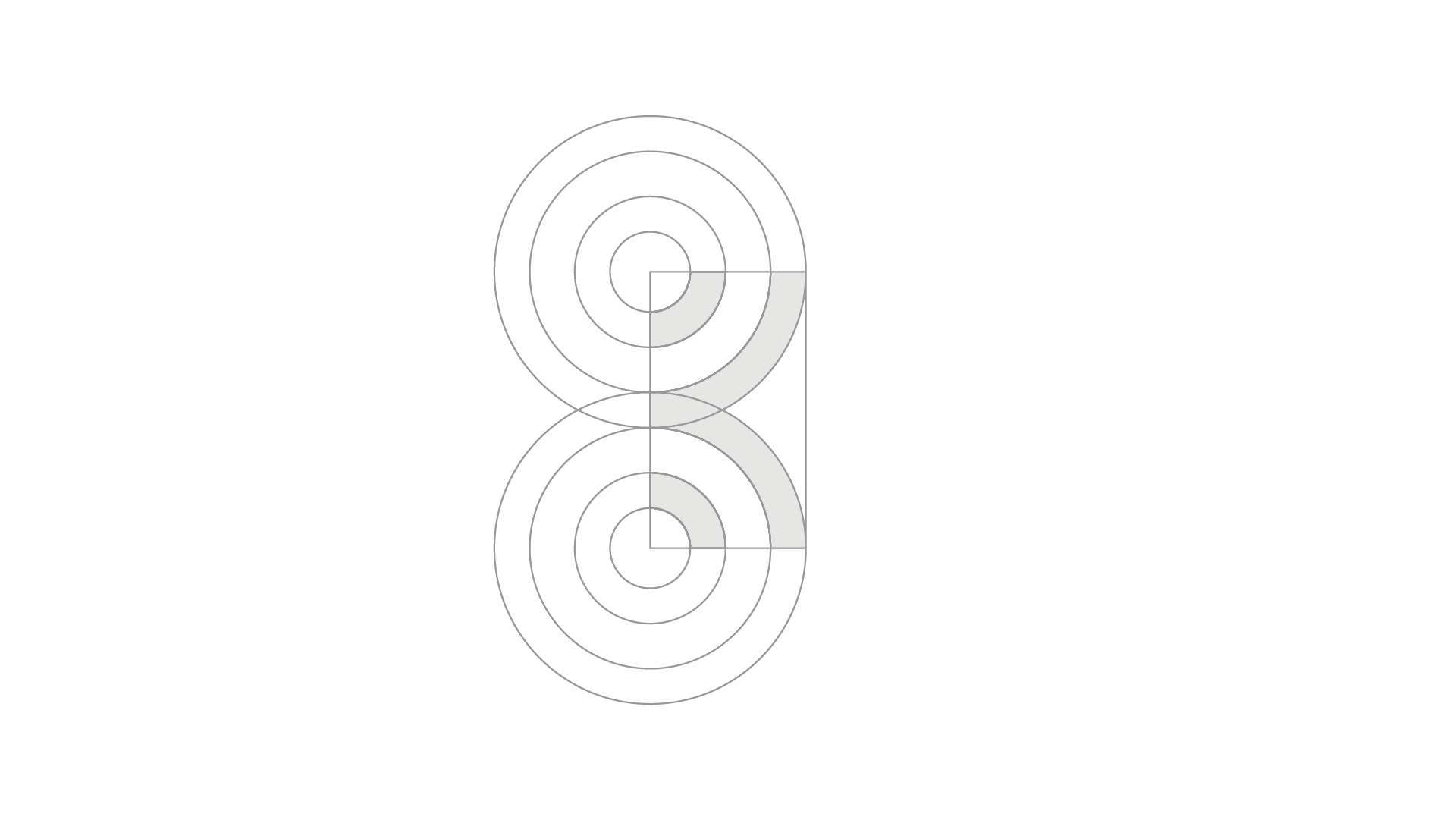
Here’s a look inside Kailife, a kitchenware brand with an aloha spirit. In Hawaiian, the word ‘Kai’ is symbolic for the sea, ocean. The good folks at Kailife wanted to embrace this symbolism in the form of a wave or water, while not appearing too ‘sporty’. The solution is a monogram ‘K’ logo that conveys water through a bit of abstraction.
Two sets of overlapping circles create symmetry across the x axis and form the letter K using the lower right quadrant of the top circle and the upper right quadrant of the bottom circle. While it was tempting to equally distance all circles from one another, the filled circles are actually closer together; this exaggerates the white space making the logo easier to place at a distance.

