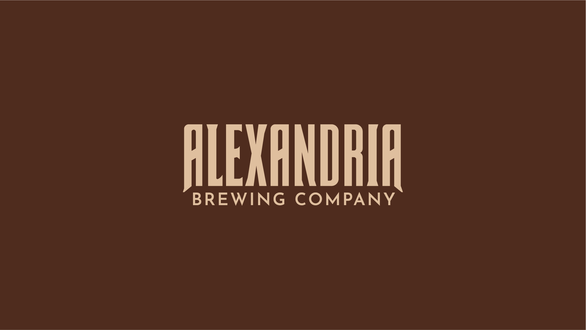
New projects call for new branding assets: here’s a wordmark for Alexandria Brewing Company. Up to this point, we’ve gotten by with just a main logo and a couple icons; however, as the brewery grows forward, a straightforward horizontal wordmark is a must have.
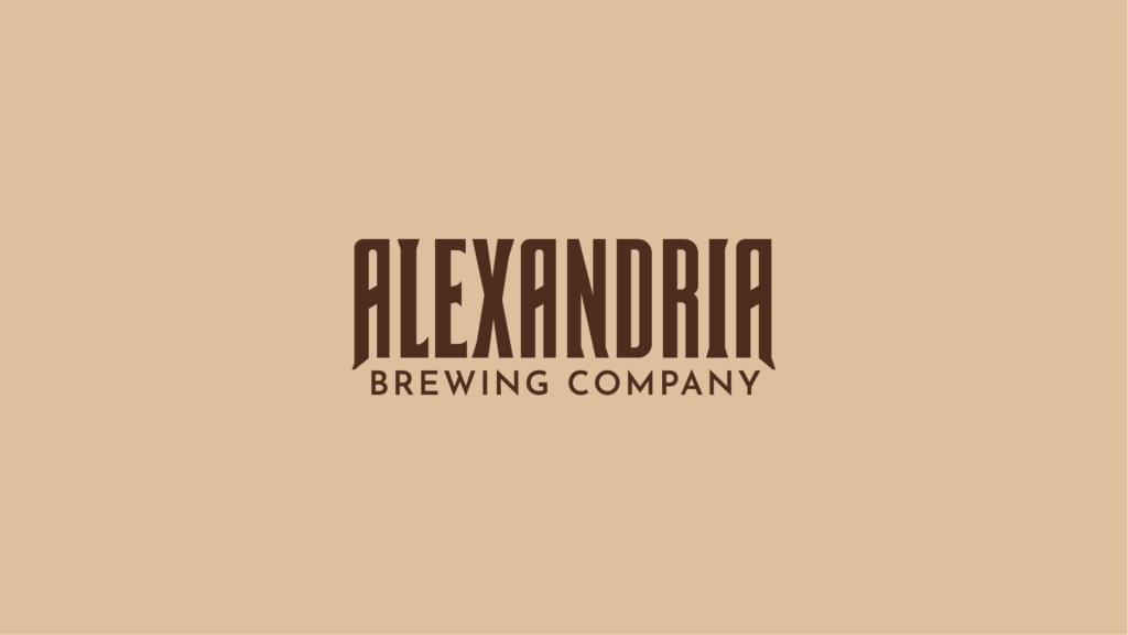
I’m particularly proud of the typographic adjustments here. We took our original typeface (chunky and misspaced) and crafted a strong mark (balanced and legible from a distance).
