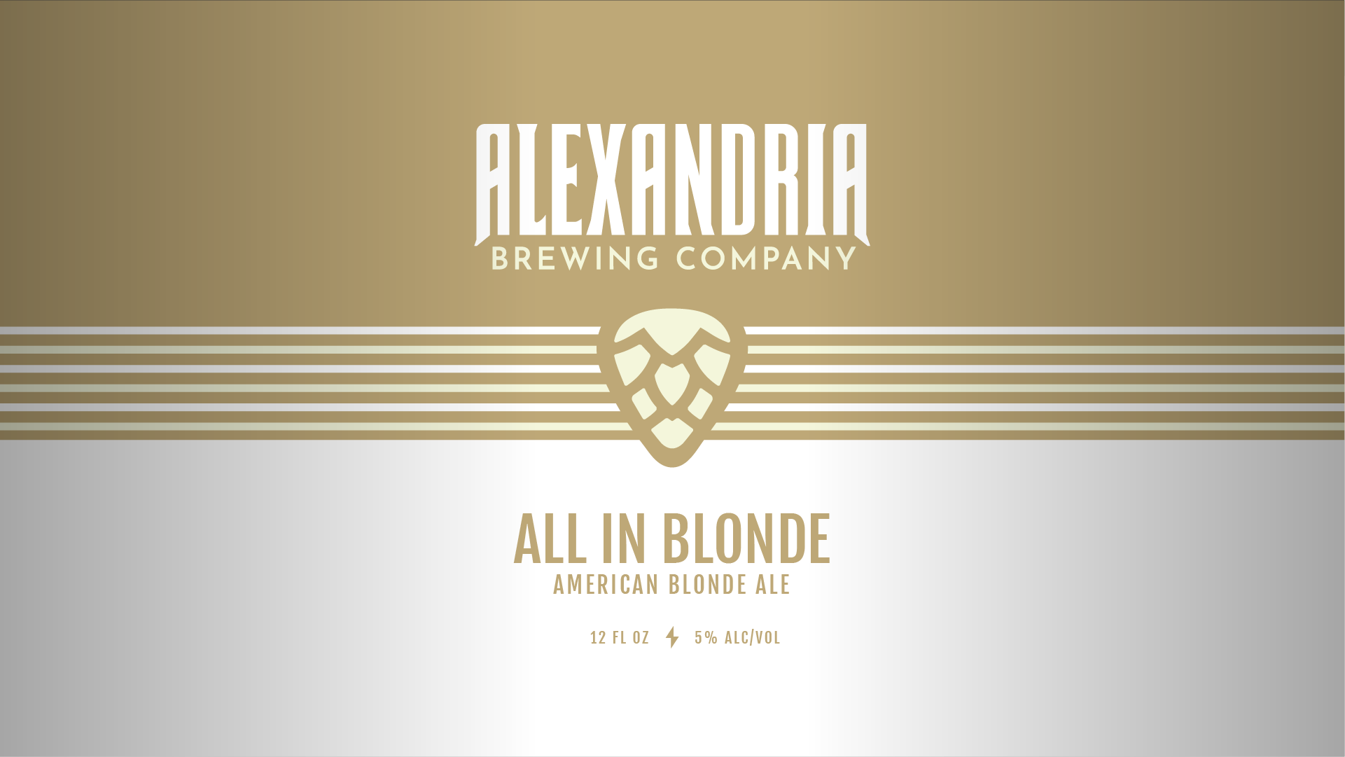
Can ready: after weeks of toiling with designs, Alexandria Brewing Company and I decided on a nice clean layout that will look great replicated across all brews.
Starting from the top, our new wordmark puts the brand name highest in the hierarchy. Centering the design are ABC’s hop pick and six stripes (symbolic for guitar strings). Below is a generous amount of space for our brew names and their specifications.
