Here we are, the final day of “Anatomy of a Logo”, a seven day series that explored the bones underneath some of my favorite logos, word marks, and brands from 2019.
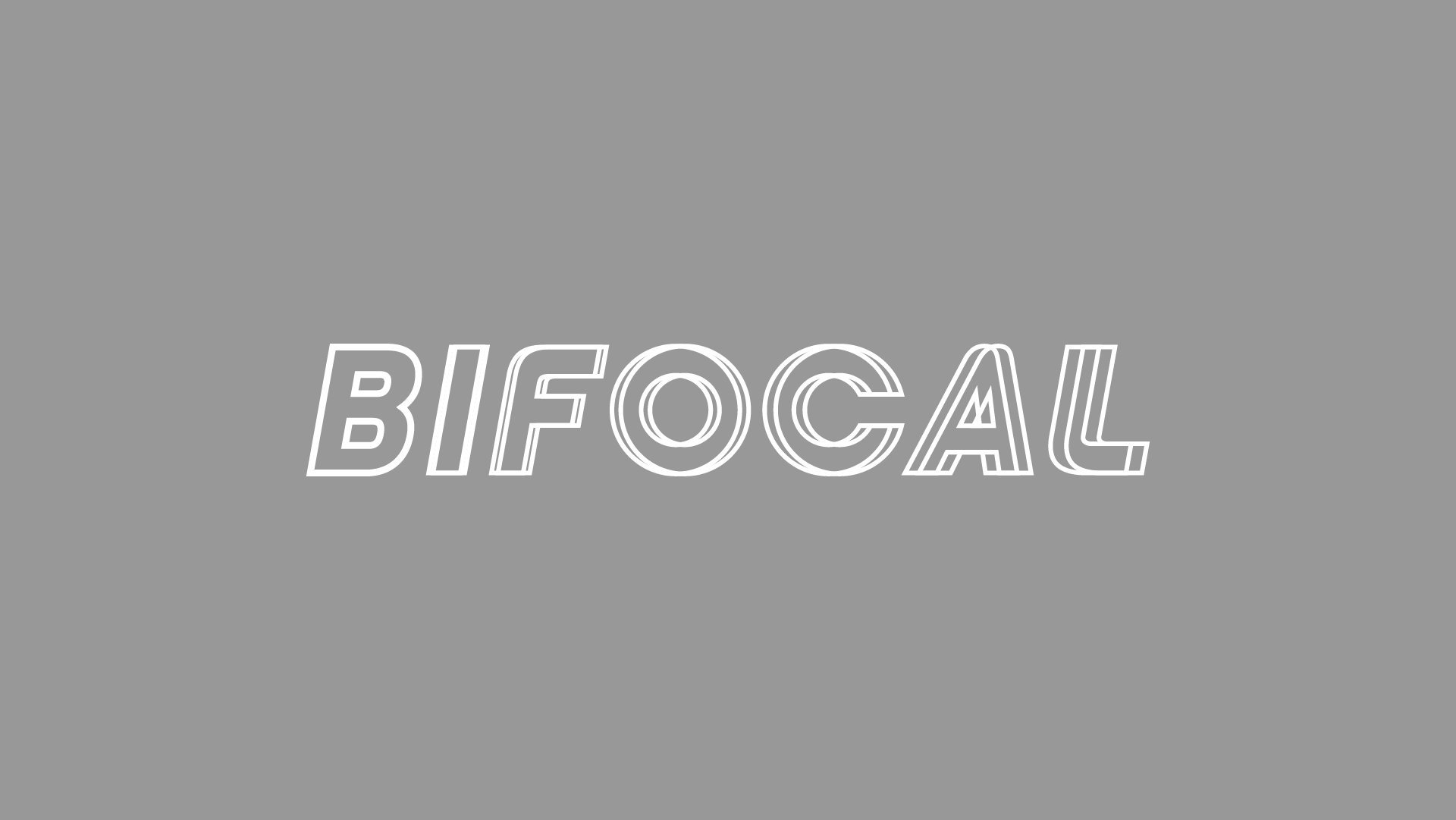
Bifocal is an emerging electronic dance music artist whose name is a reference to the infamously high prescription glasses he wore in grade school. It took a slew of type adjustments to transformed “Viga” font into the Bifocal wordmark we now know. Among these design choices, two really stand out:
- The letter “B”, the only non-blurred piece of the wordmark, is slightly bolder than its counterparts. This adjustment was necessary as a visual trick of the eye. The blur effect on the consecutive letters creates the visual perception of increased thickness. Without this adjustment, the letter “B” would look awkwardly skinny in comparison.
- Our letters “O” and “C” were formed as perfect circles – a reference to glasses frames or eyes.

