Here’s day two of “Anatomy of a Logo”, a seven day series revisiting some of my favorite geometry based designs from this past year. Although these underlying elements will go mostly unnoticed, they provide a solid foundation; our eye will recognize this balance passively.
This logo in progress is for a nutritional supplement company looking to fuse together a brand with both futuristic and natural elements.
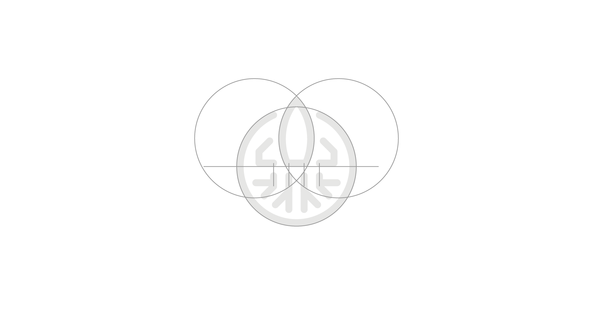
- Three equal sized overlapping circles create our rocket form and the container that holds the icon together.
- A horizontal line cuts the logo in half and establishes a baseline for the rocket to sit.
- Key anchor points on the rocket and its wings align with roots below.
- The roots and wings share common angles at 135 and 90 degrees.

