Big thanks to everyone who voted for the Pain & Repetition designs!
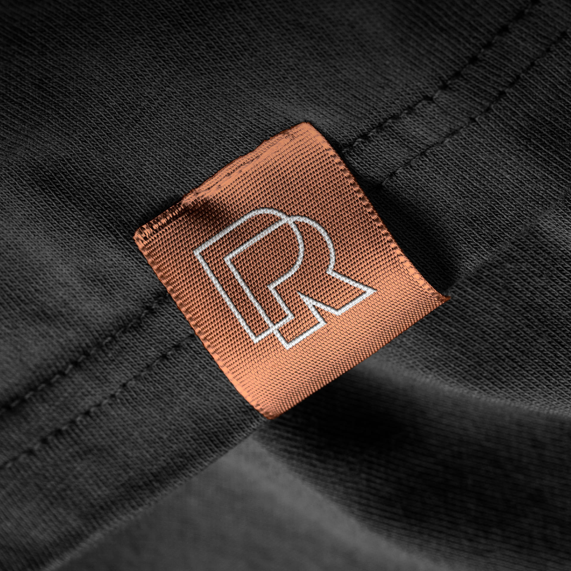
Of course, the winner ended up being the upper left design, the very first mark I came of with of the bunch. It’s a solid choice with the P and R overlapping – fits nicely on a square tag.
I’ll follow up with the full breakdown and all the variations connected to this concept.
