I’m thrilled to partner with an emerging Chicago brand, Crossings. These guys are building a fashion forward apparel company featuring unique and scarce product lines.
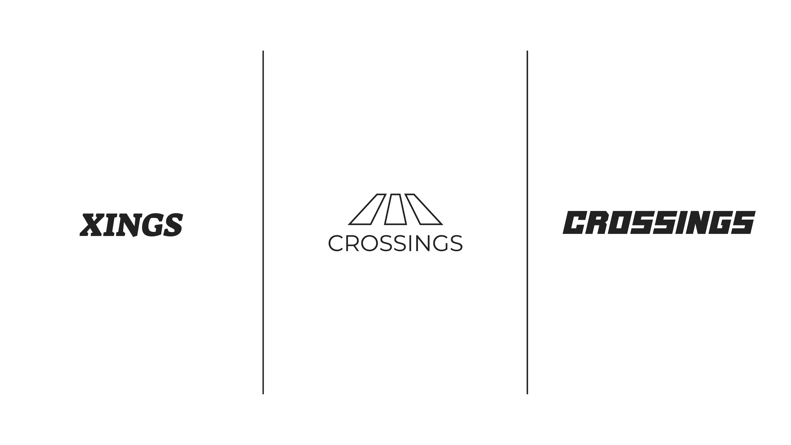
Below are a few of the key wordmarks and logo designs pitched during our creative process:
- Serif: classic, yet bold. Reducing ‘Crossings’ to the alternate five letter phrasing saves us some horizontal space. Fewer letters = more characterized typography.
- San-serif Crosswalk: this is our modern approach. Simple shapes give us a depth perception of street crosswalk lines. The thin weight is modern and elegant.
- Blocky: Crossings came to the table with this logo concept already in mind. Its a bit of a sporty throwback – bold, forward, rigid.
