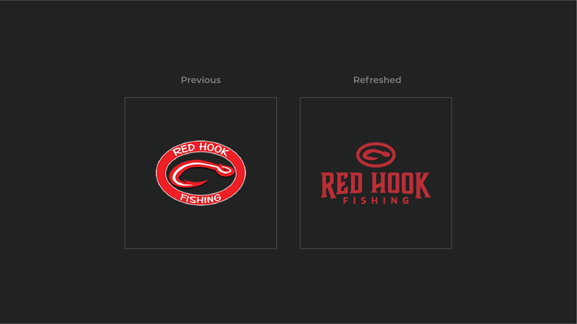
The Red Hook project is actually a bit of a logo refresh. Adam’s team came to the table with a pretty cool existing icon that they enjoyed and that their clients recognized. Together, we made a few key adjustments for flexibility and embroidery:
– Simplified the icon and minimized detail.
– Included a healthy amount of white space.
– Developed a new wordmark that can be used with and apart from the icon.

