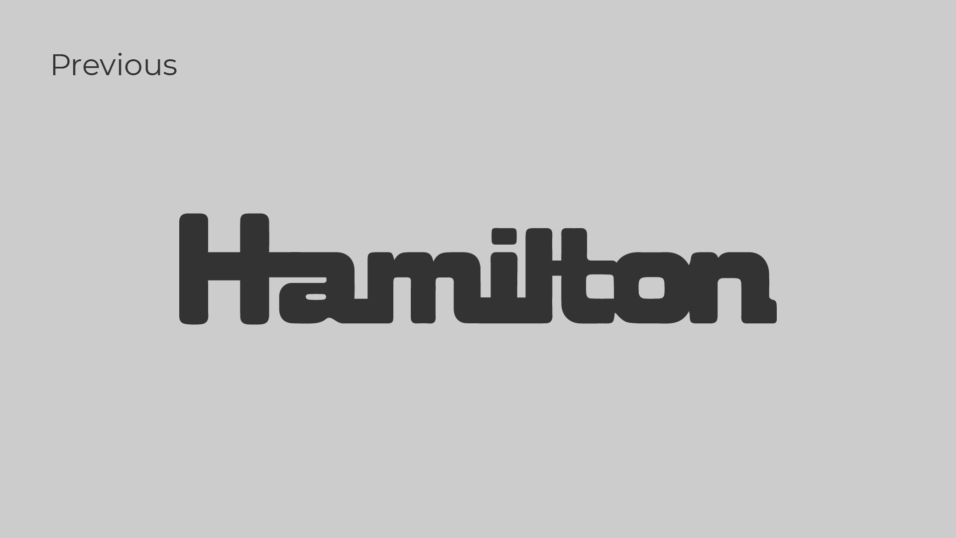
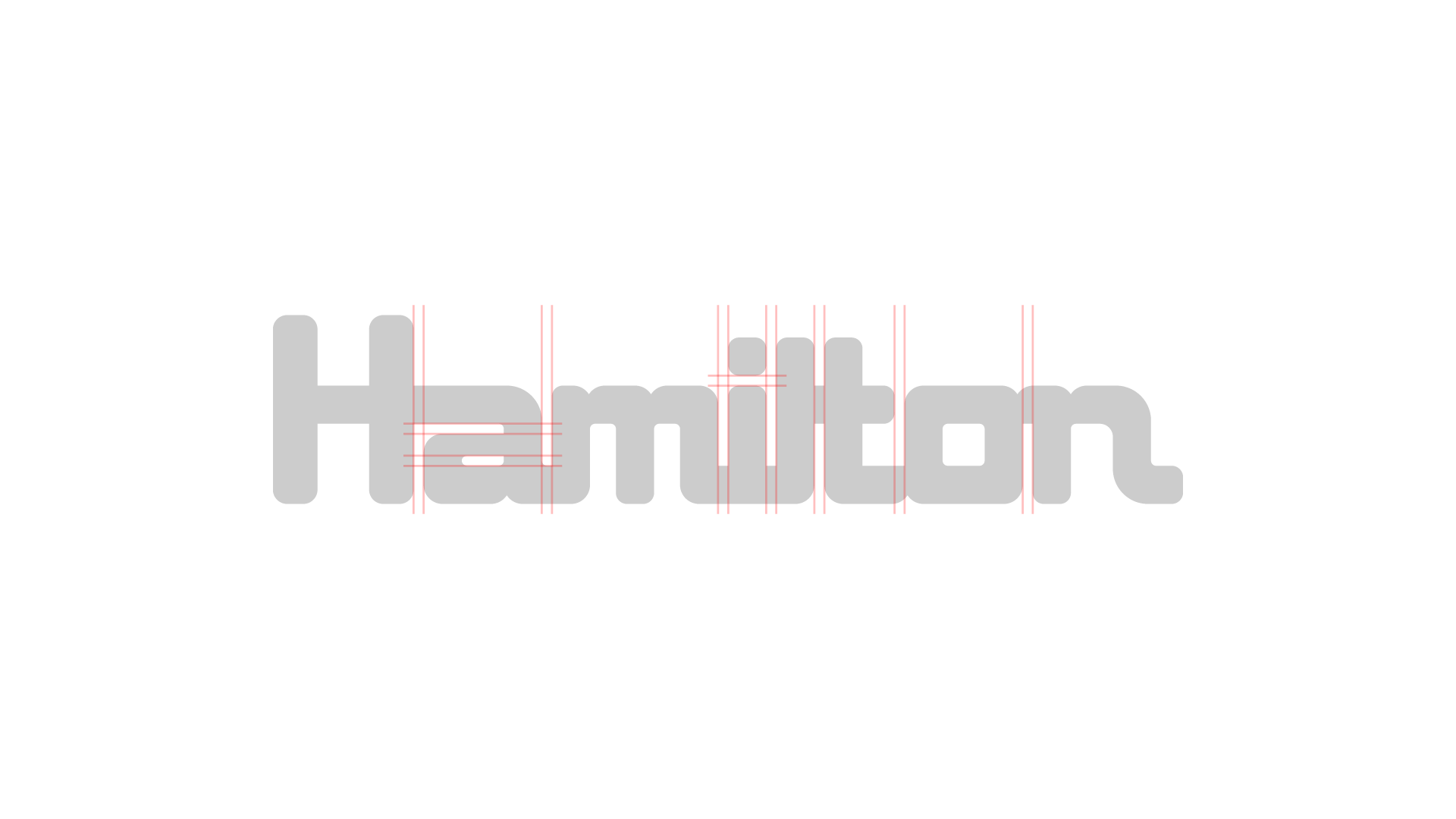
Recently I was asked to inspect a client’s logo. When I opened the editing file, I took a big gulp: chaotic anchor points, uneven widths, and mismatch corners made for a sloppy wordmark that was otherwise quite nice.
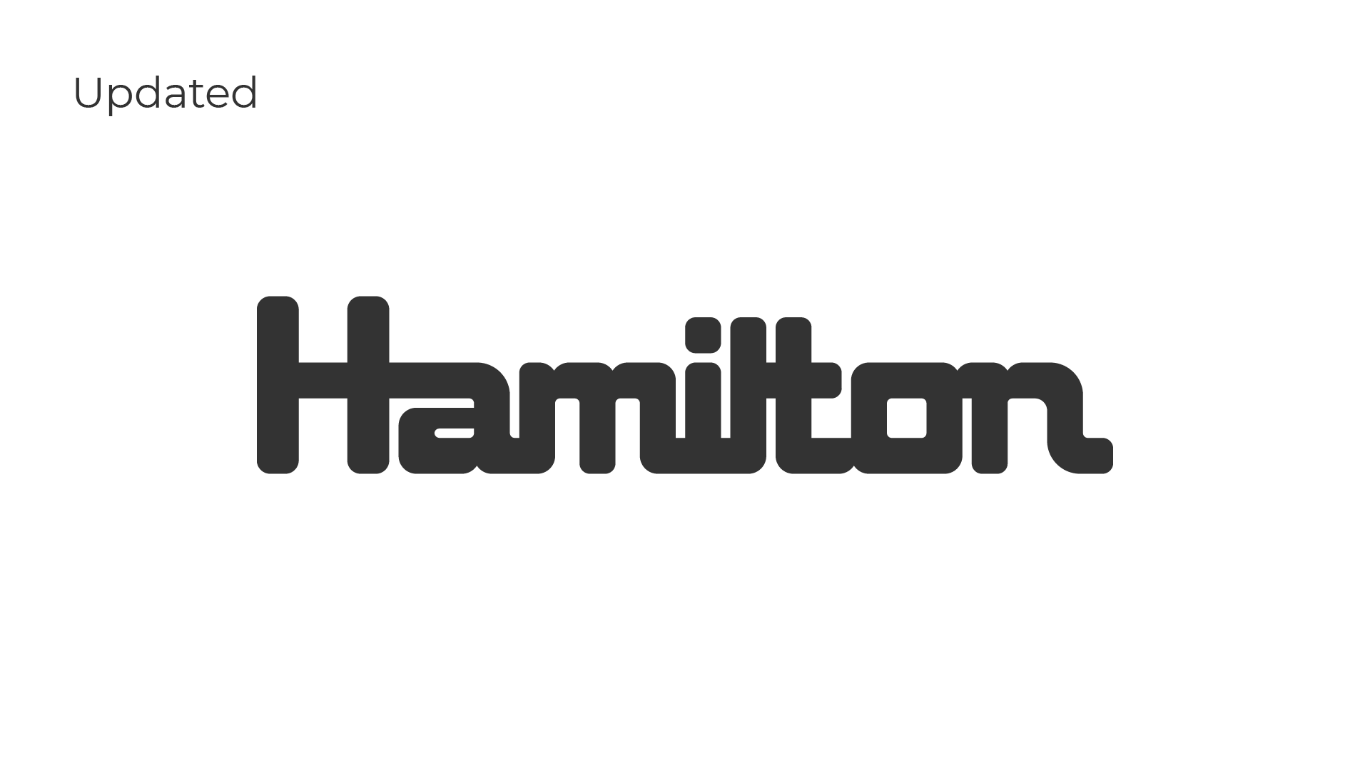
Together, we fixed these issues to create a new logo that is geometrically correct. Better yet, the new design mirrors the previous so the majority of folks won’t realize there was a change. Some of the changes include:
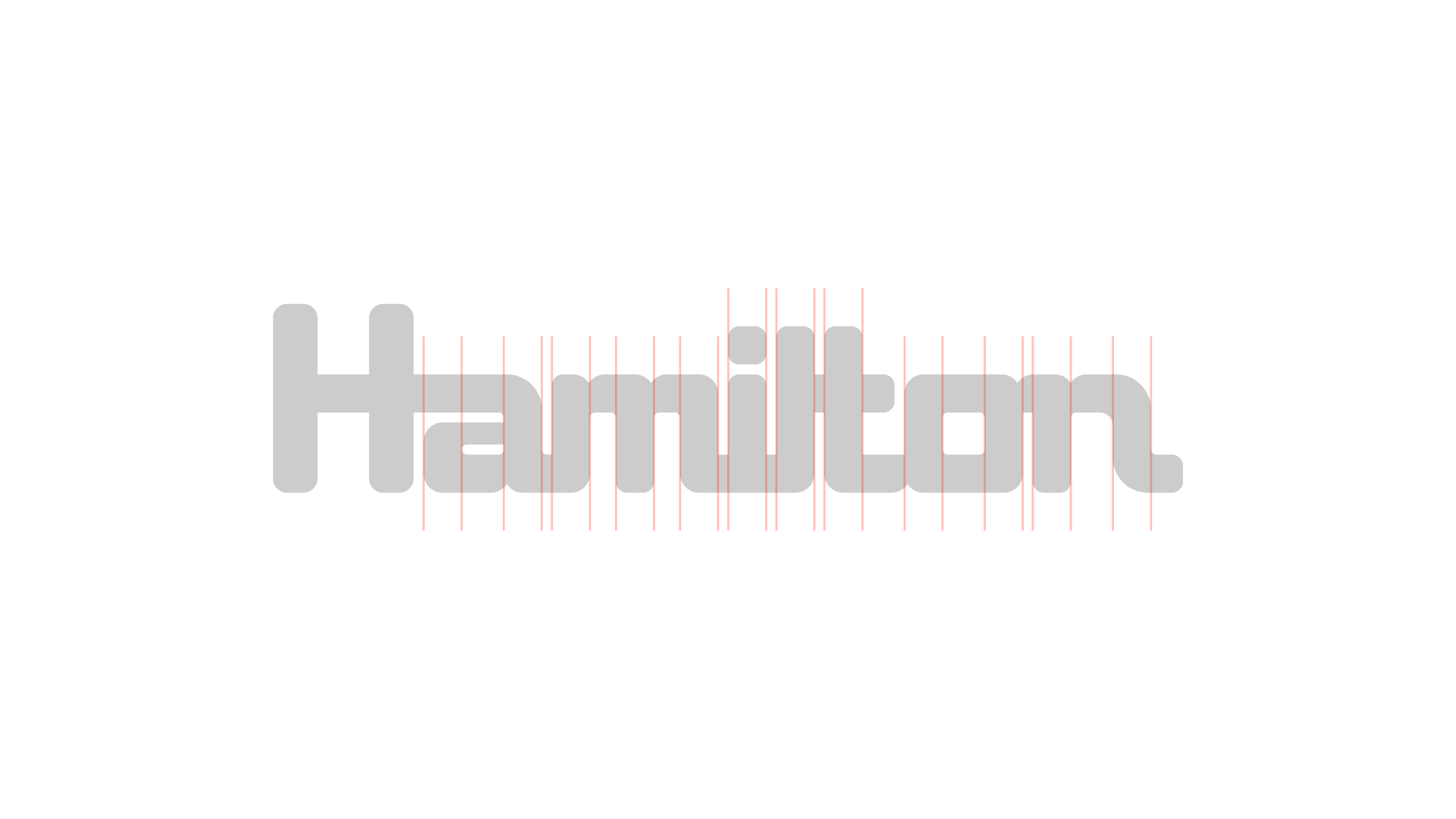
- Standardized widths between characters
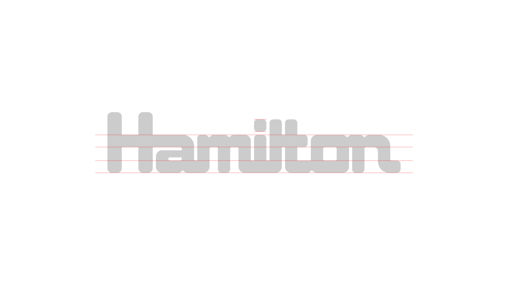
- Standardized weight of typography
- Rounded corners that are consistent and visually correct
- Increased legibility with space added between the ‘T’, ‘O’, and ‘N’
- Emphasis on the key letter ‘H’
- Extra flare added at the end of ‘N’ to sell the classic typographic style
- Minimization of vector points
