I’ve experienced an explosion of professional growth since I left the Army last year to pursue design full-time. So much so that projects created just a few months ago are becoming dated by my current standards.
One of these projects is All American Metal Art, a Veteran Owned welding shop prolific in its production of American Service themed metal art. With the launch of allamericanmetalart.com next month, we revisited the logo built last Summer.
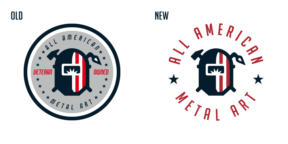
Logo simplified: with the main welder icon unchanged, we removed the excess shapes to instead focus on the readability of the ‘All American Metal Art’. We switched to a tall non-italic font better suited for the circle wrap, 12 stars went to 2, and ‘veteran owned’ was dropped to be mentioned elsewhere in the branding. The result is a much cleaner mark.
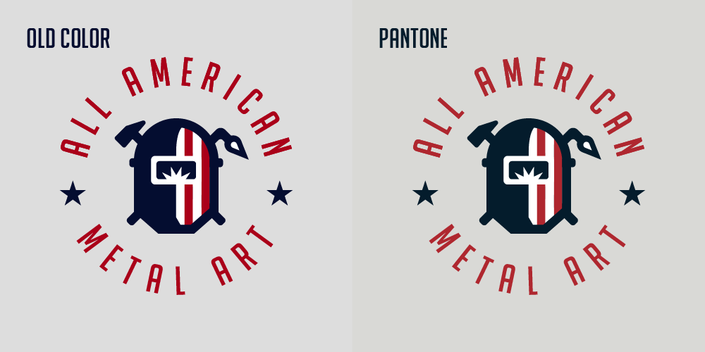
Conversion to Pantone: to save future printing headaches, we converted to a universal Pantone color palette, which gives us a more professional (less punchy) feel.
Wordmark: most brands should be represented by both a square logo and horizontal word-mark allowing for flexibility in a brand’s usage and application. This word-mark will find a home in All American’s website header.
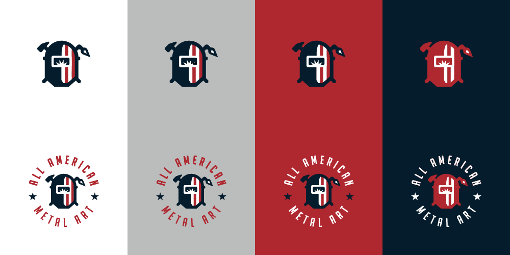
Flexibility: the previous design looked ‘just okay’ on dark backgrounds. Here, we made a couple alternate color schemes giving All American the freedom to use its brand on most backgrounds.
