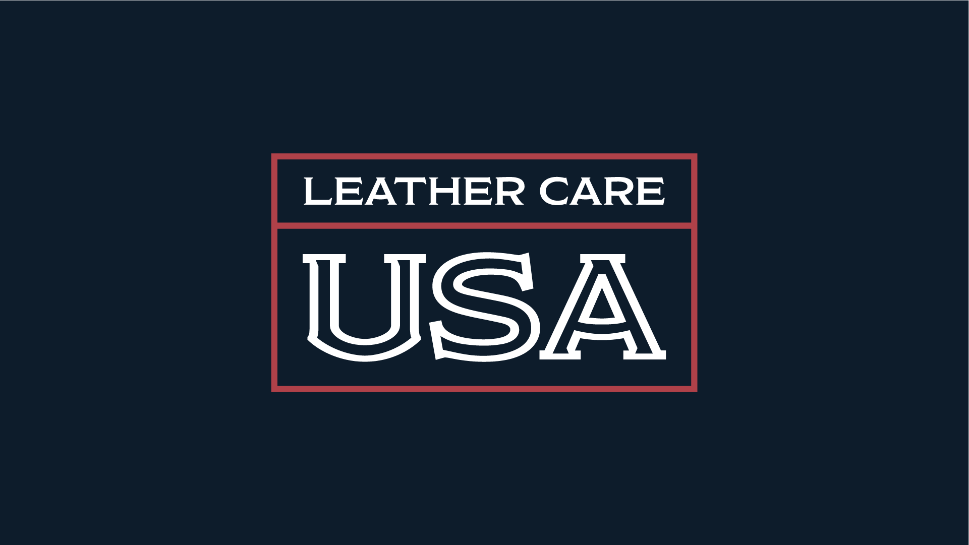
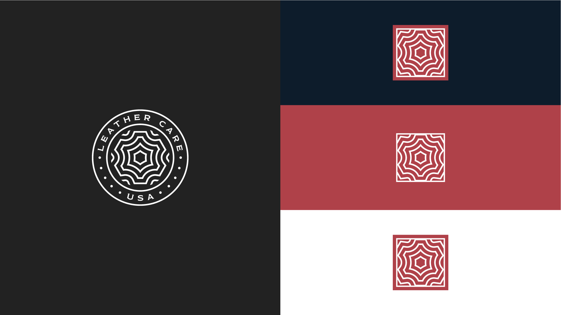
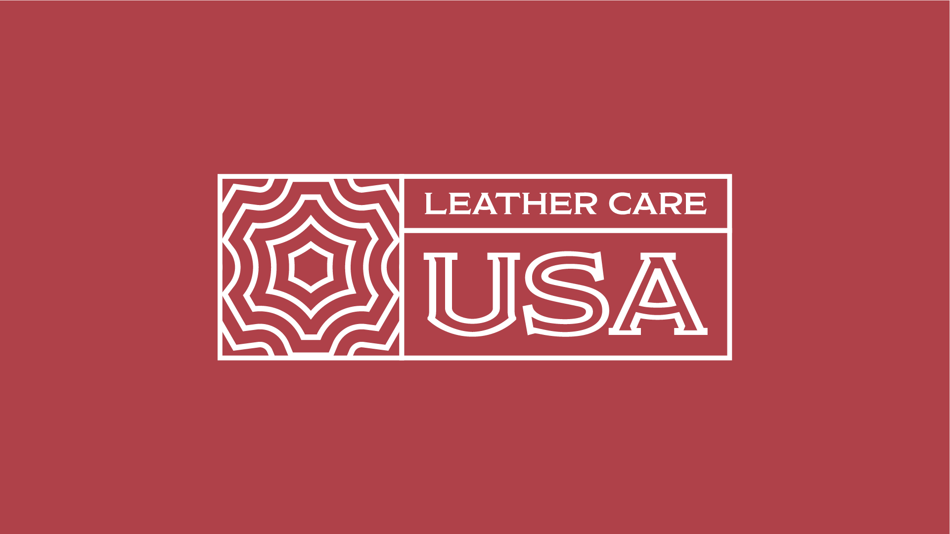
The normal programming has been canceled to give some love to this dead design.
Okay, okay, so this one wasn’t picked by the client, nor received any votes in our poll, but was my personal favorite choice for Leather Care USA.
I particularly like how USA is unevenly outlined with a thicker profile left to right. The icon is completely unconventional, but would look real slick stamped on a piece of leather. The piece is a contradiction, vintage & modern – in my mind, it lives on!


