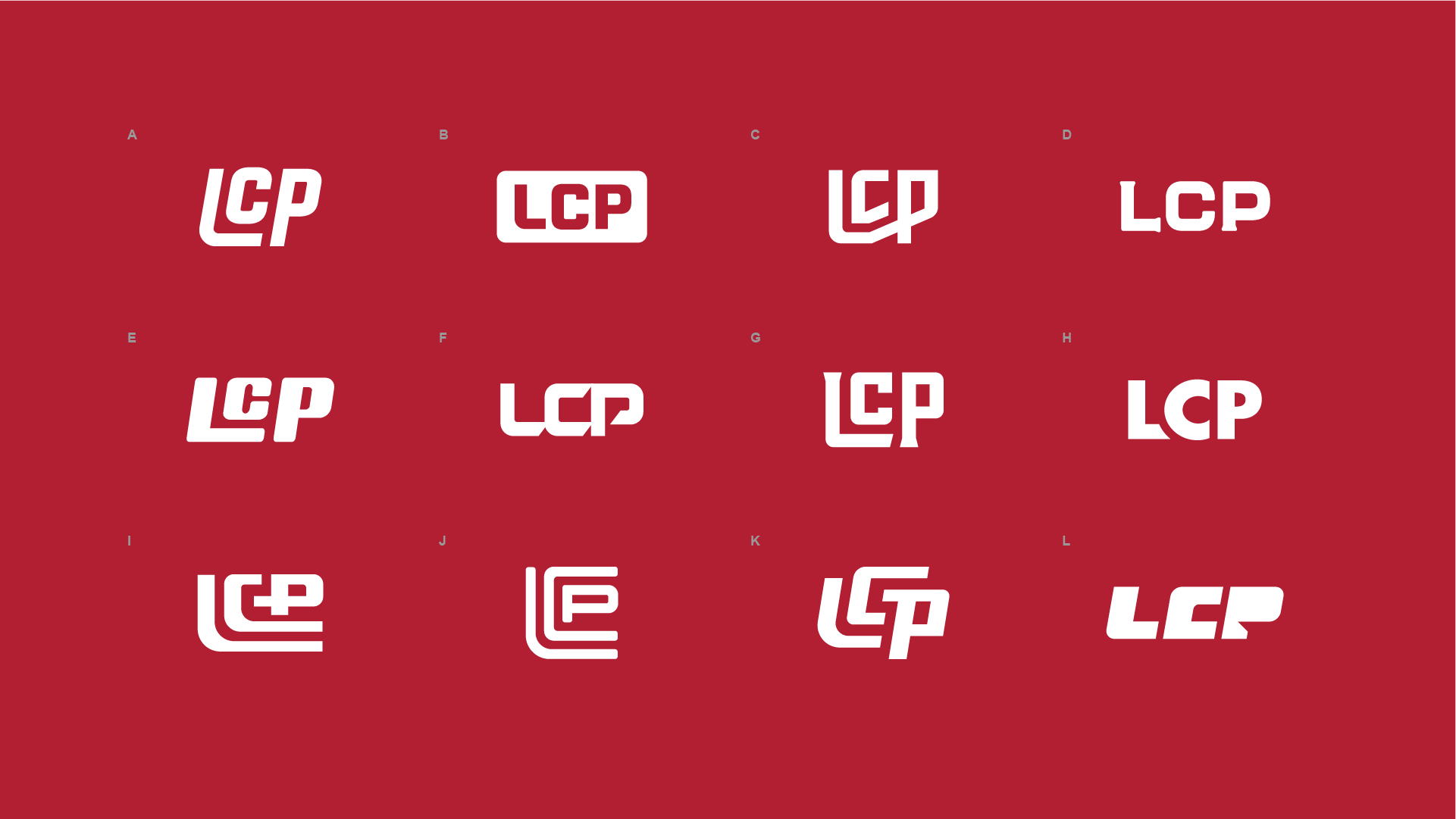
For this client, the approach was different: create as many ‘LCP’ monograms as possible. No analysis. No judgement. Just design.
And the results turned out great! Usually this many concepts dilutes the quality of the design; however, I’d grade almost all of these an A, maybe a B. Any one of them could lead the LCP brand.
