A design first brand and style forward logo that rallies electronic dance music fans.
Our challenge was to compose an aesthetics-first brand that will draw in and hype fans of electronic dance music (EDM). The unidentified artist (formerly known as Chanceman) has reinvented himself as Bifocal, a reference to the infamously high prescription glasses he wore in grade school. Now turning hobby into daily obsession, Bifocal is on the look out for insightful beats and a logo that will match his progression wave for wave.
Services
logo design
branding
album art
apparel design
Location
Phoenix, Arizona
Accolades
2019 Gold Addy Award, Logo Design, from the American Advertising Federation
Our Approach
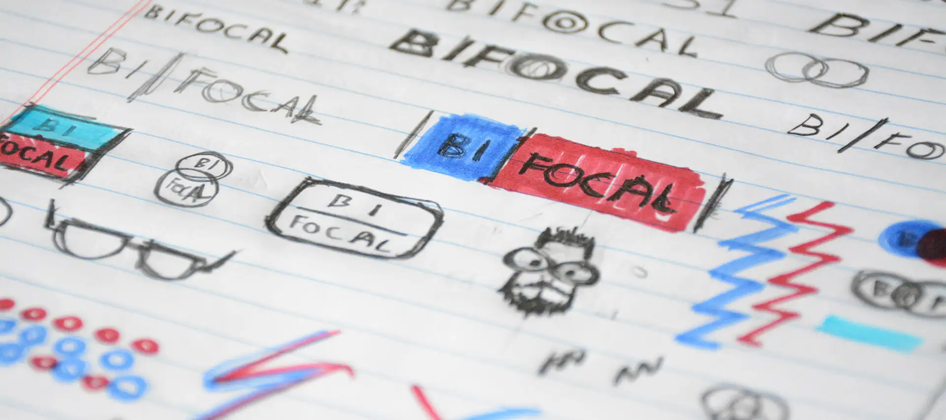
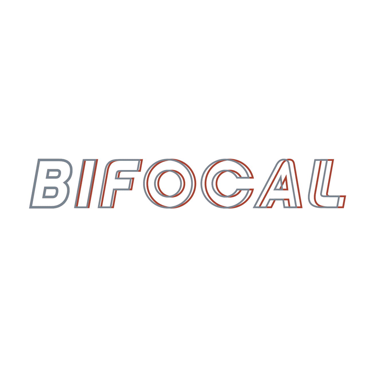
Bifocal came to the creative table with visions of vision. Inspired by the blurry ‘o’ in the Focus Features logo, we set out for blur effects that operate in the vector universe. The solution is offset typographical outlines growing blurrier from left to right. This simple effect made up of straight vector lines will ensure that the wordmark looks as intended everywhere. A color palette of red and blue is the foundation for brand elements based on three-dimensional glasses.
impact
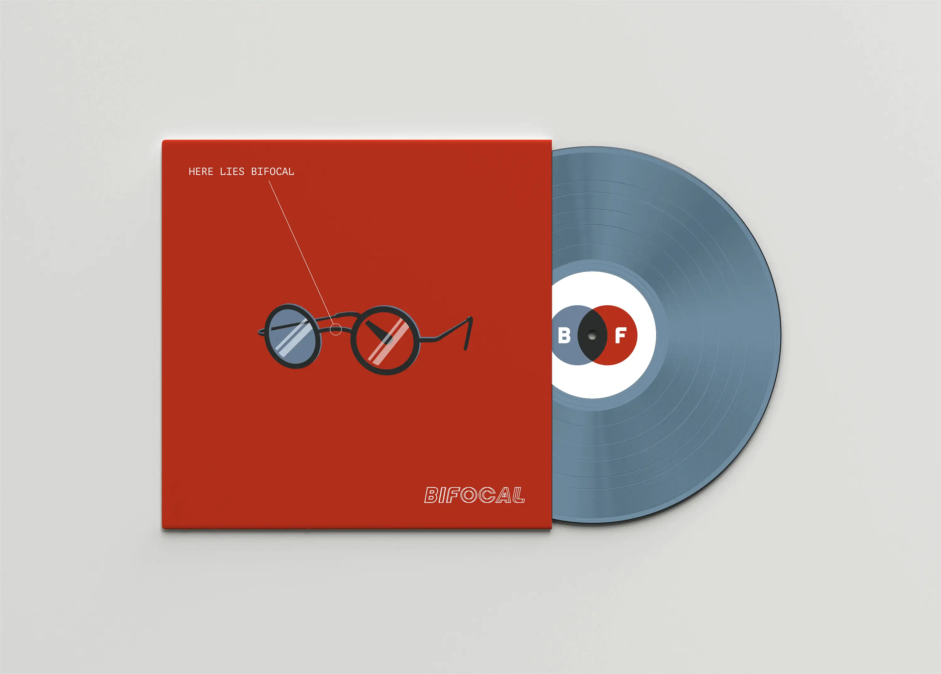
The logo reveal was a huge moment of enlightenment for Bifocal, who worked meticulously towards a debut album following this project. Together, we coined the album title Here Lies Bifocal, and the dream was born. You can find these beat thumbing tracks on all major streaming platforms.
Feedback
“I couldn’t be happier with the final brand. The whole experience was fantastic from beginning to end.”