I’ve got some design trickery to show off!
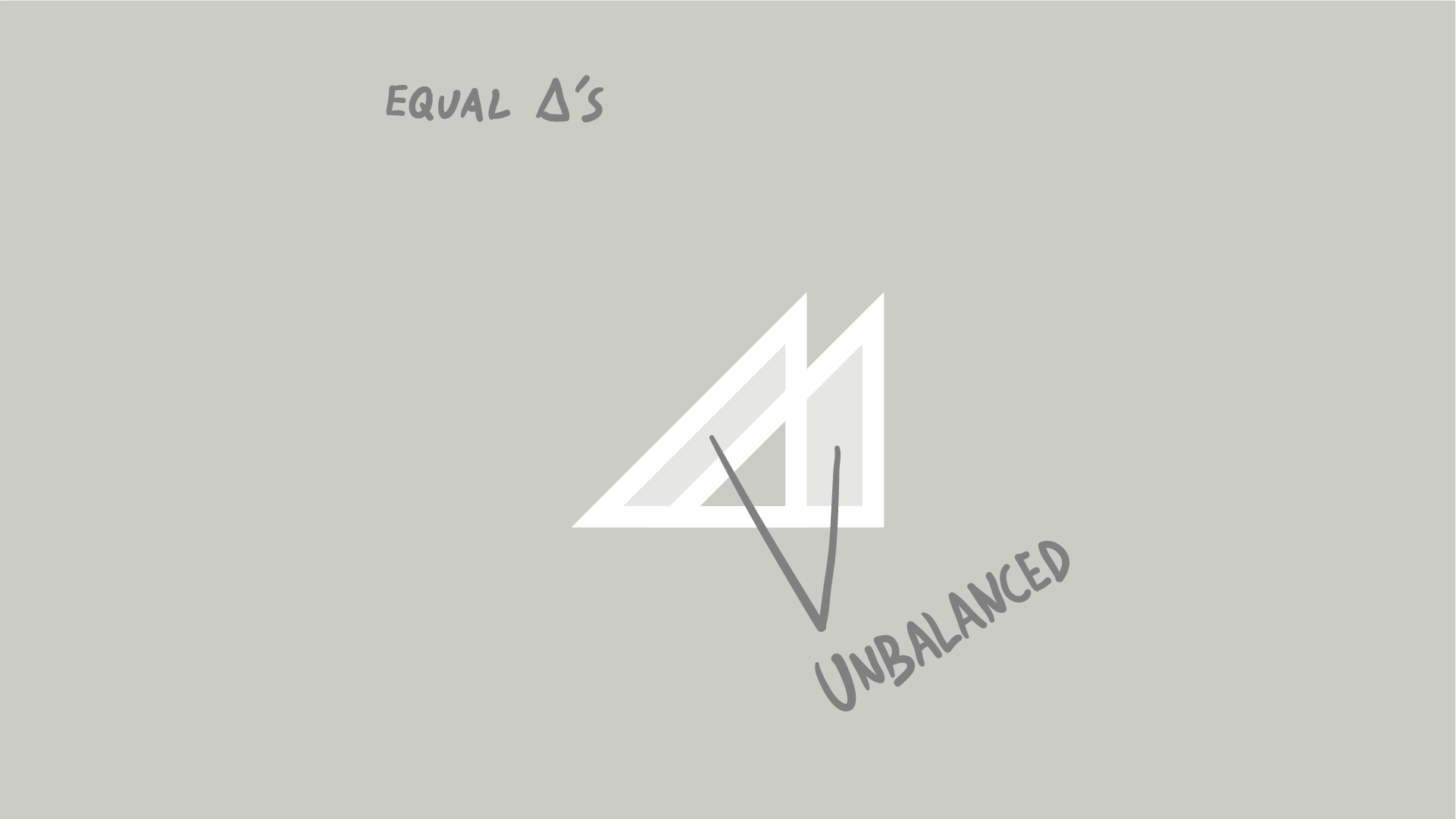
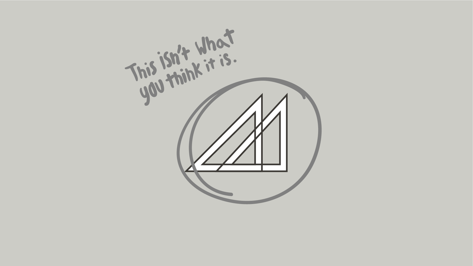
This initial idea called for two overlapping right triangles, and for the longest time, I couldn’t get their positioning right. Any way I placed them, the white space between the two, their balance, it was off.
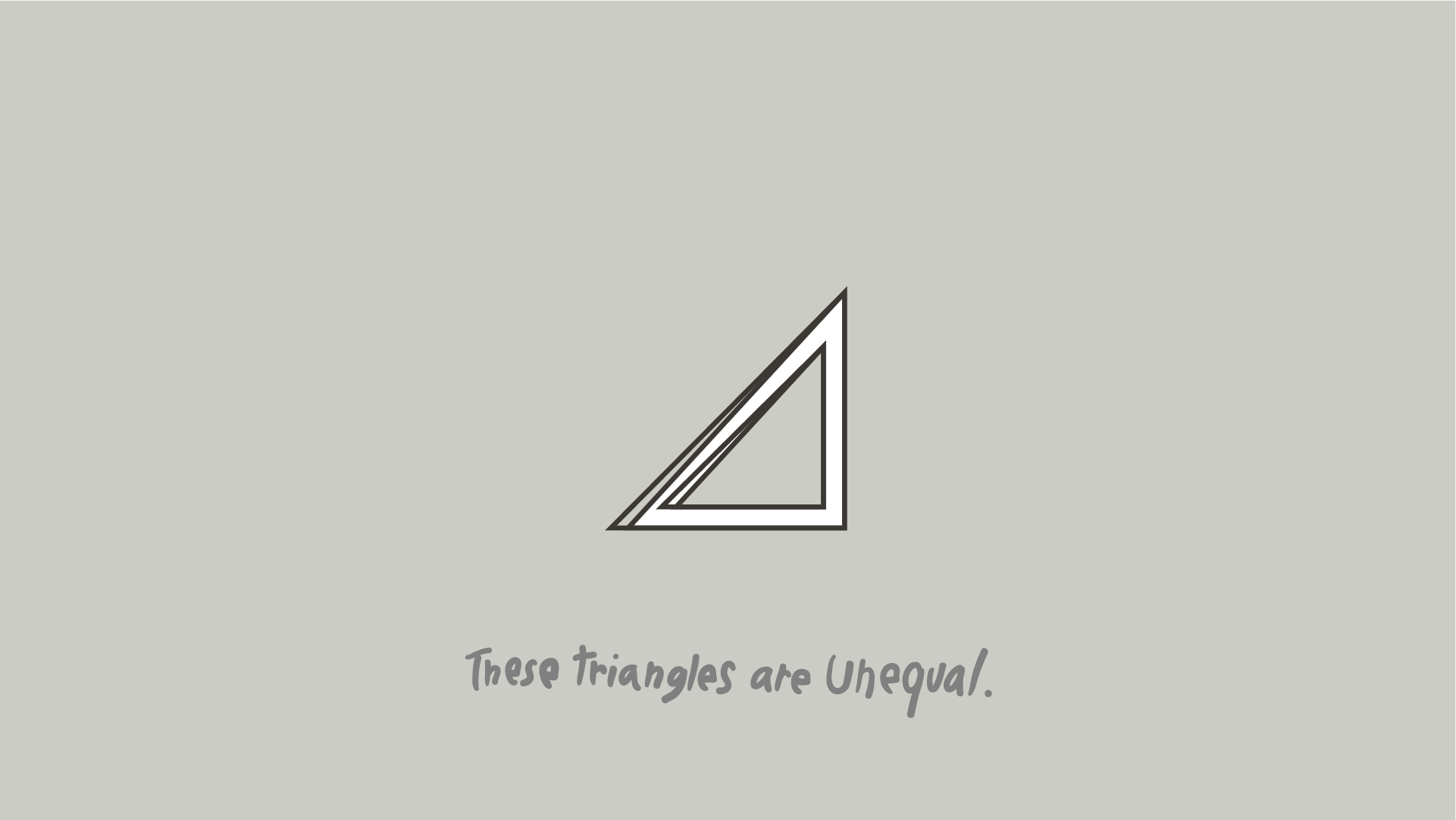
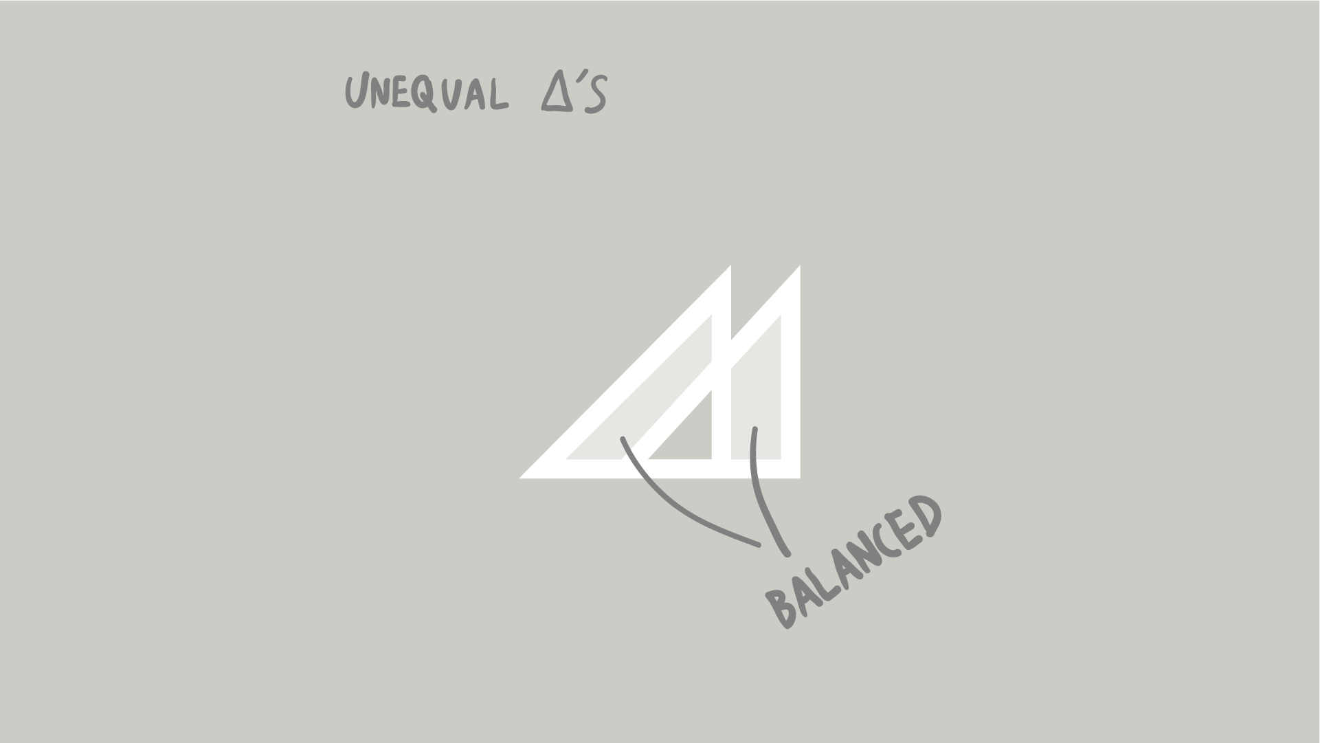
The solution was unexpected. I changed the pitch of one of the triangles, and snap, they fit together perfectly.
What’s correct geometrically is not always correct to the eye.
