Today is day three of “Anatomy of a Logo”, a seven day series revisiting some of my best geometry based designs from this past year.
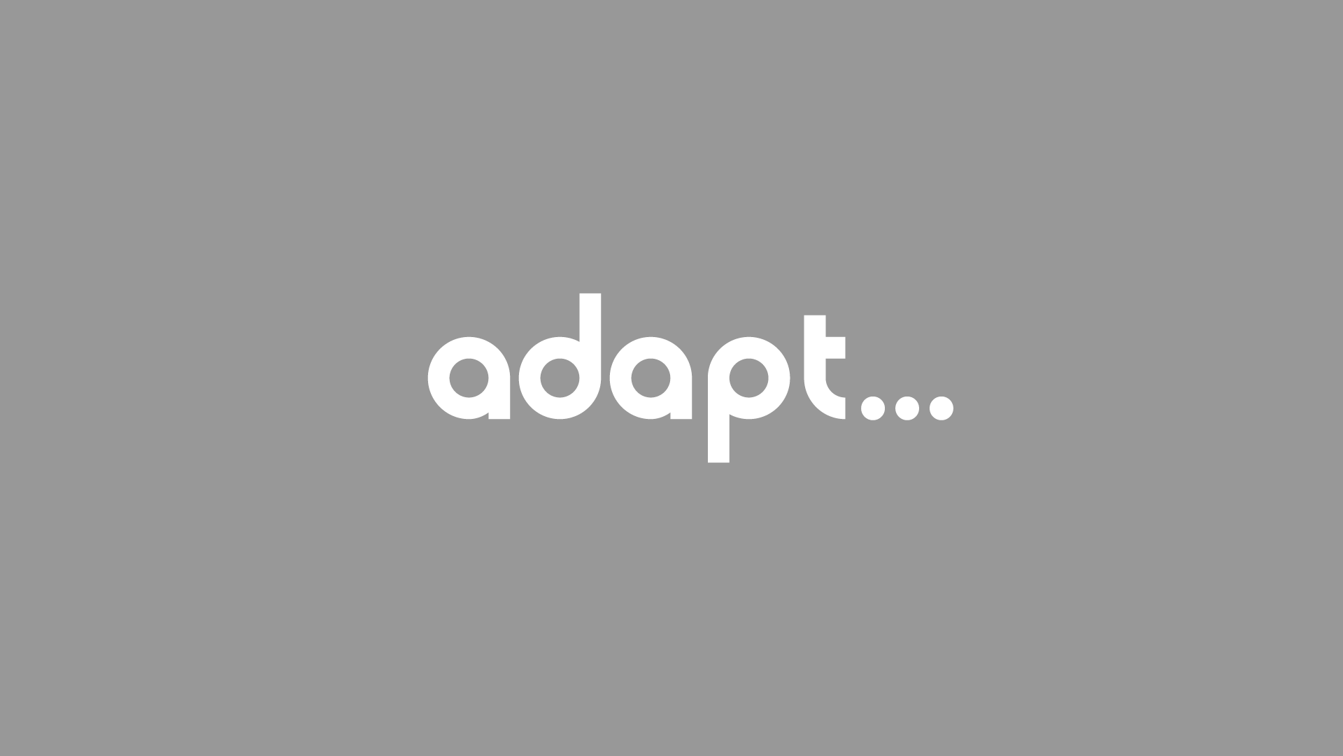
Here, we take a look at the custom typography behind the Adapt Social wordmark and logo. Adapt is a social media marketing group based out of Miami Beach, Florida that prides itself in keeping up with fast paced trends and strategy. We used an ellipsis to visually communicate their ever-changing nature.
- Three dots create our ellipsis. Their diameters are (visually) equal to the thickness of our type.
- The circle shape reappears in the letters themselves with 4 of 5 letters sporting perfect circles and the final letter “T” carrying a quarter circle at its base.
- Letters “D” and “P” are the same shape flipped at 180 degrees. Their presence as the second and second to last letter give the logo a unique symmetry. Of course, both ascender and descender lines are equivalent because of this.
- To improve legibility, our “A”s are slightly altered at the base breaking from their perfect circle form. This exaggerated wedge between the circle and stem help ensure that the “A” continues to look like, well, an “A”.

