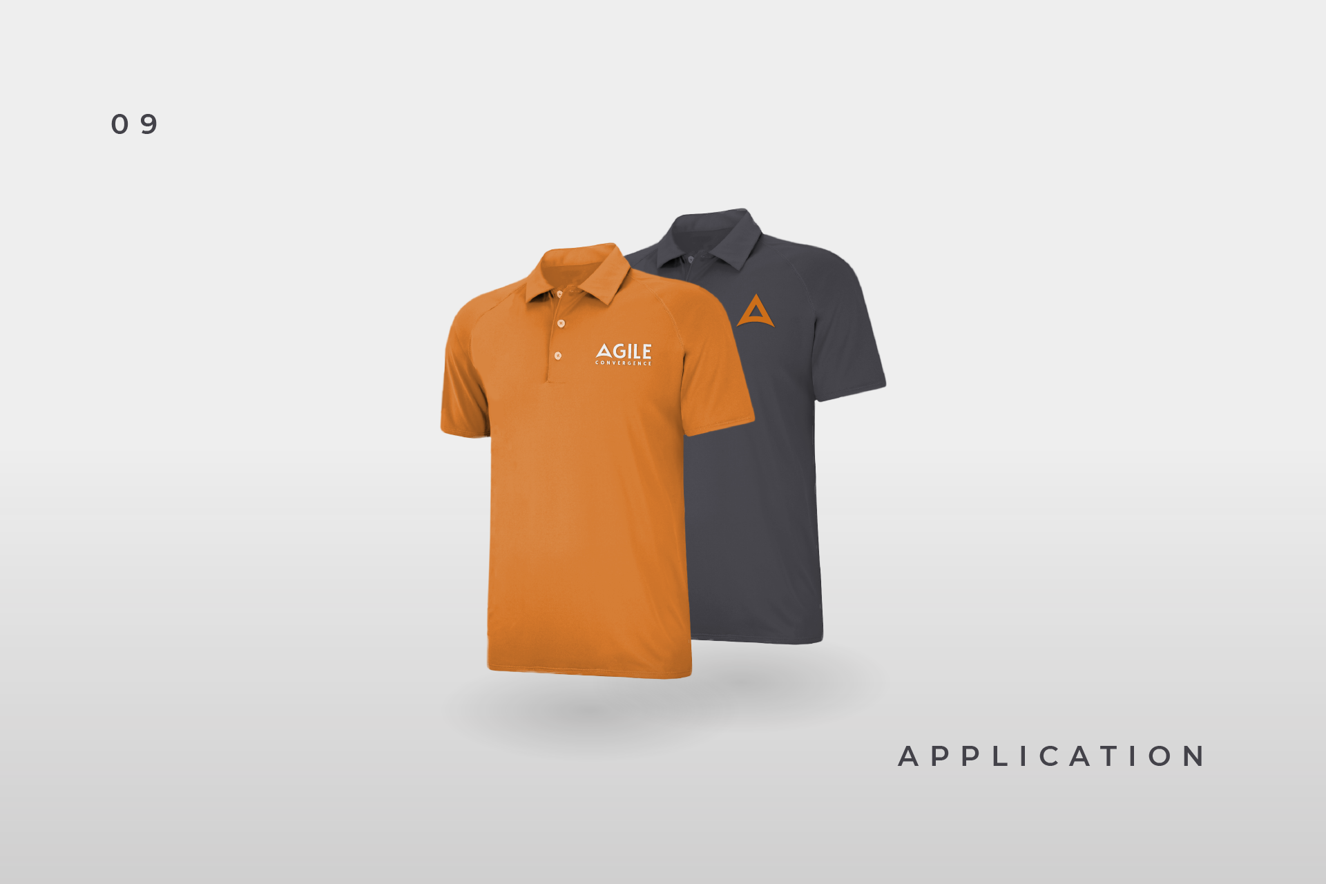
Capping off 2018 is a set of brand guidelines and logo design for Agile Convergence, a consulting firm out of Colorado Springs, Colorado based on the Scaled Agile Framework.
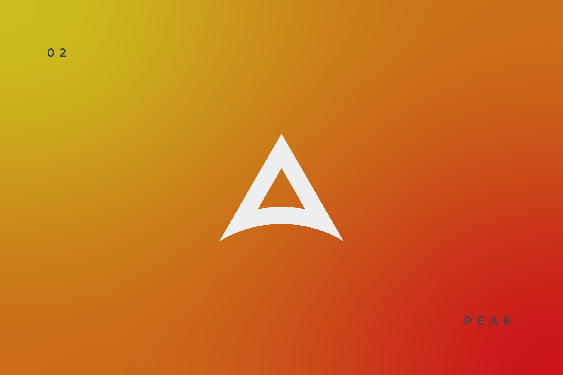
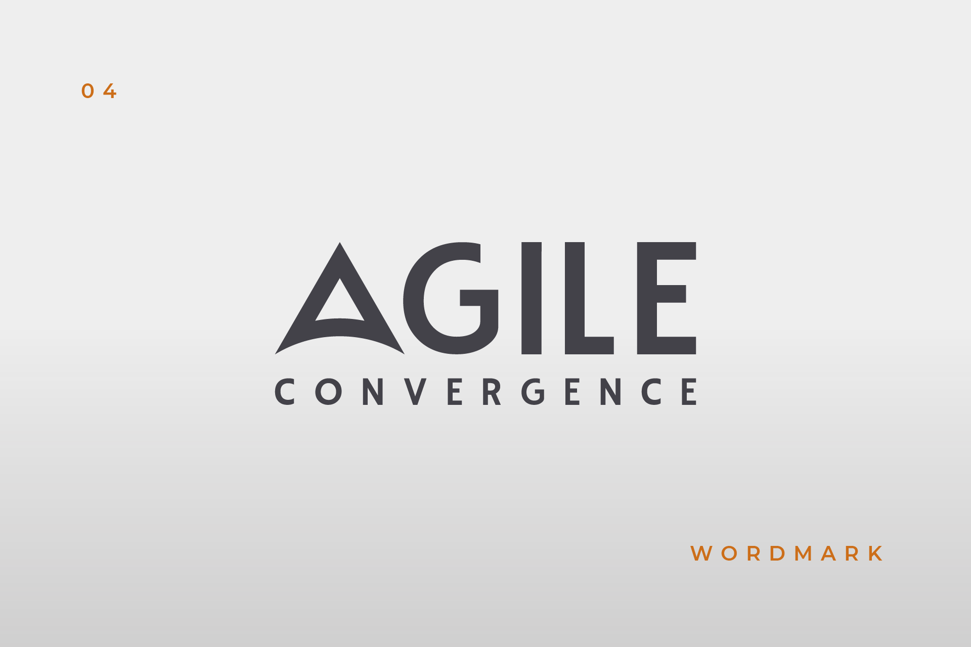
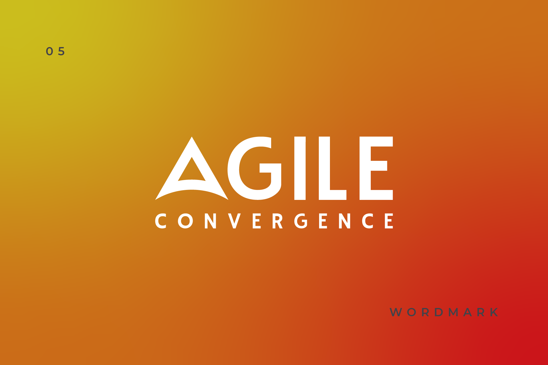
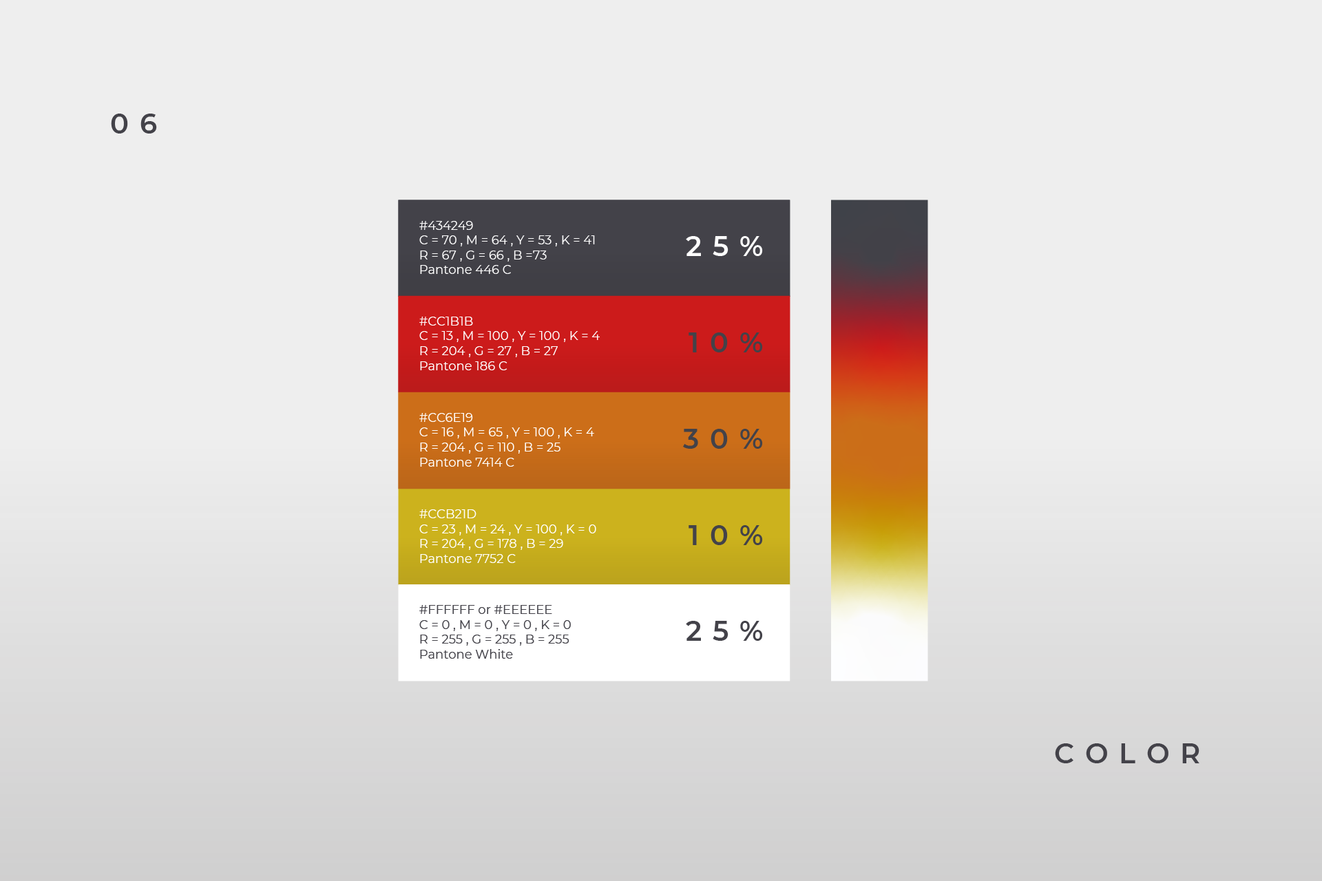
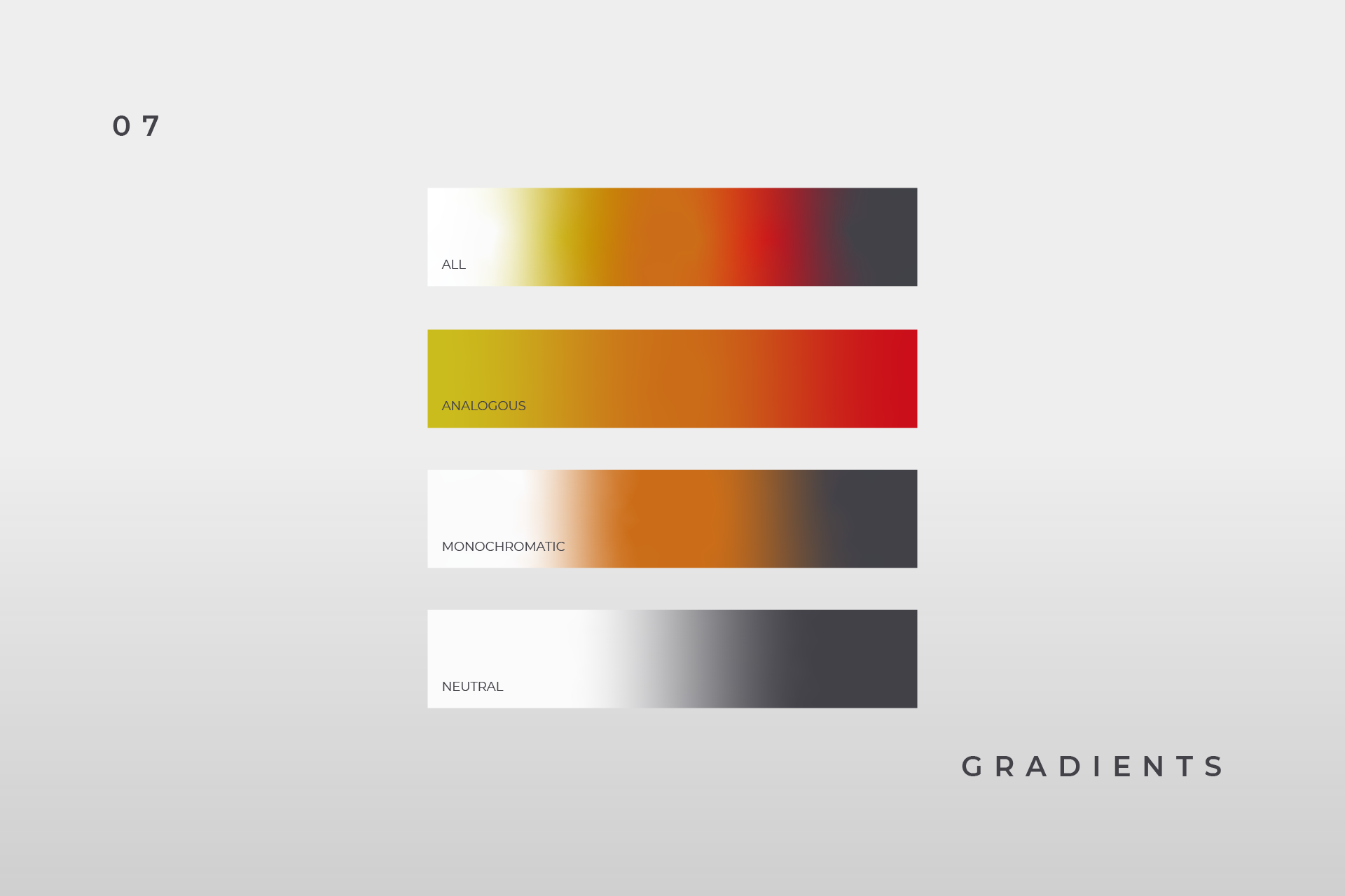
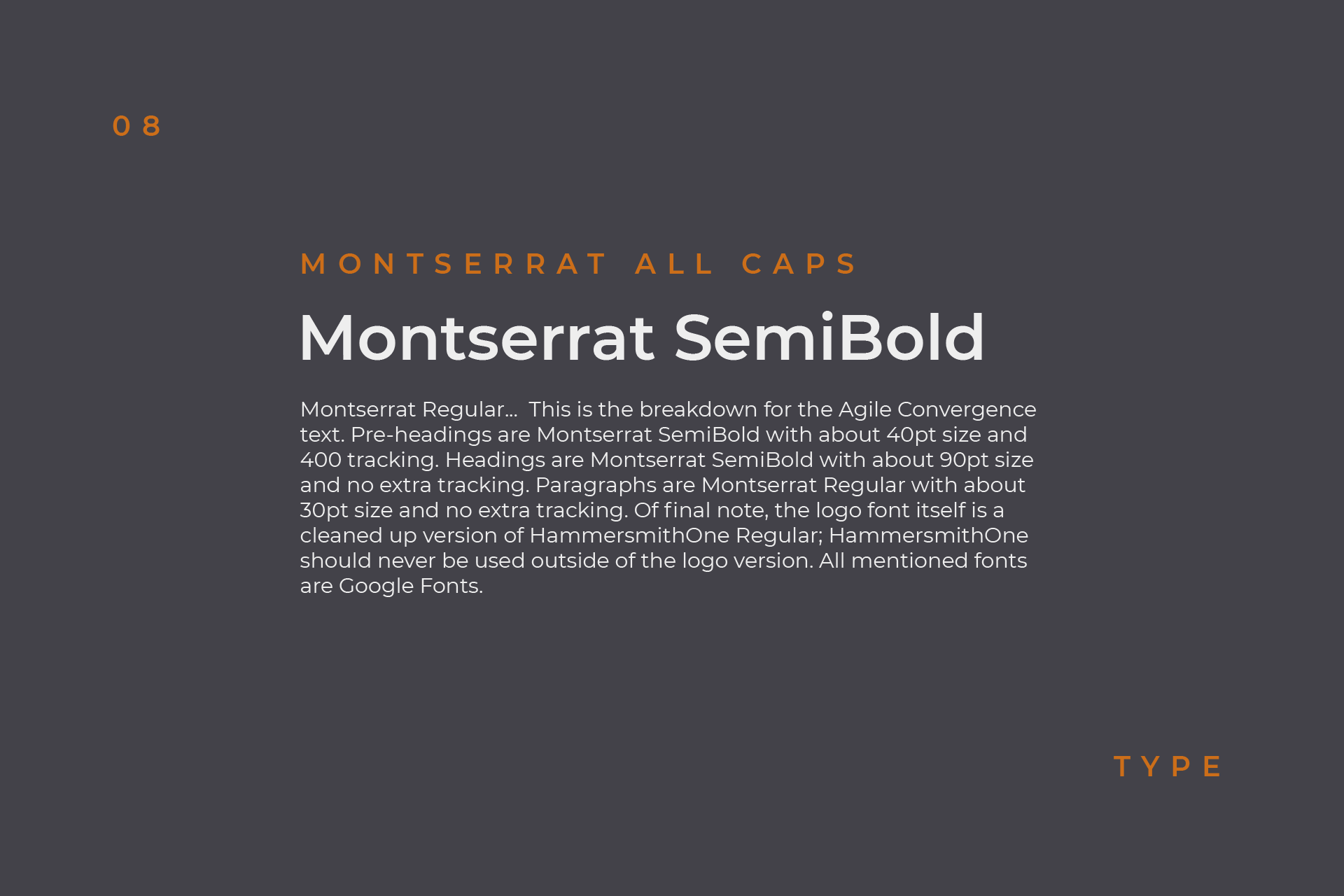
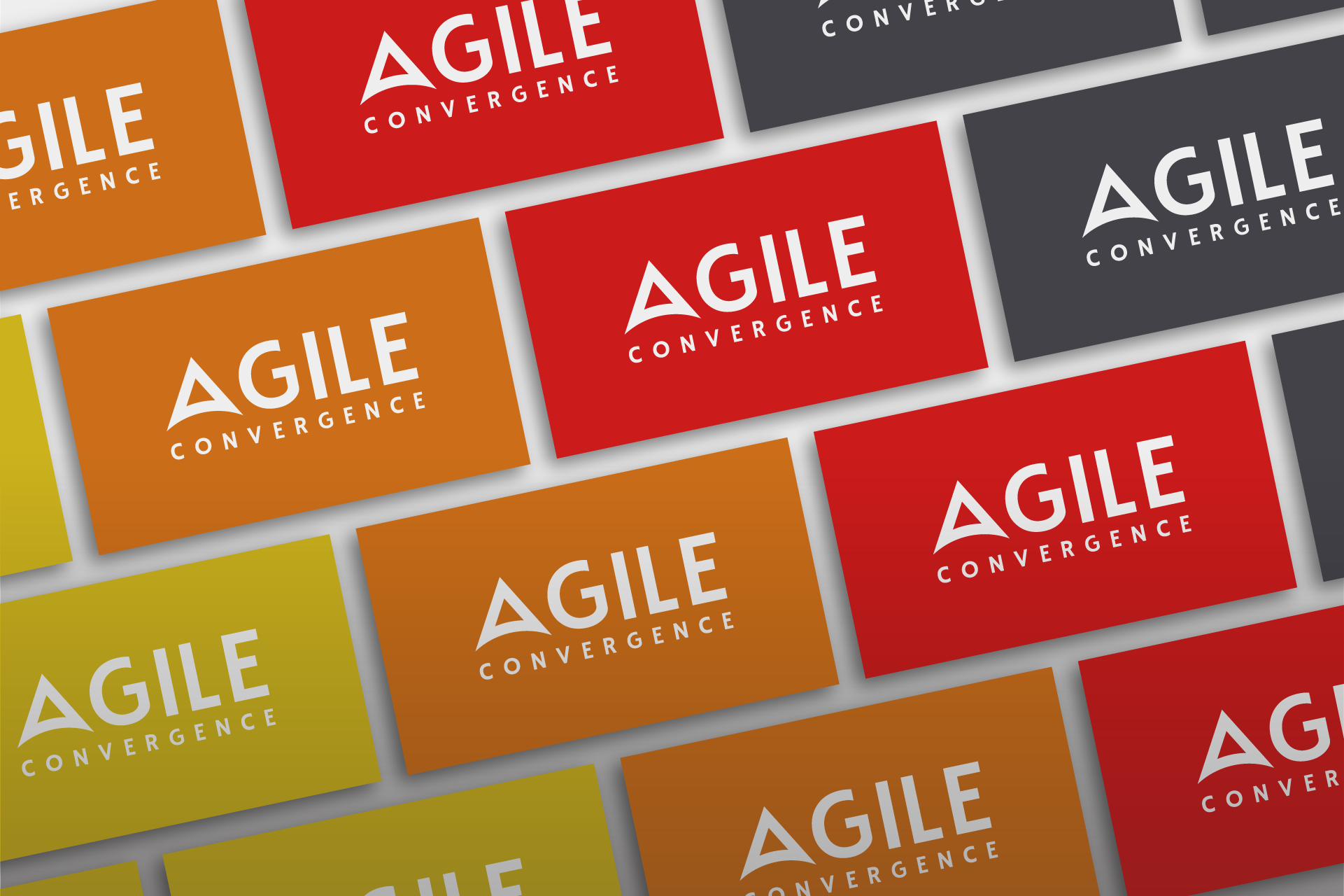
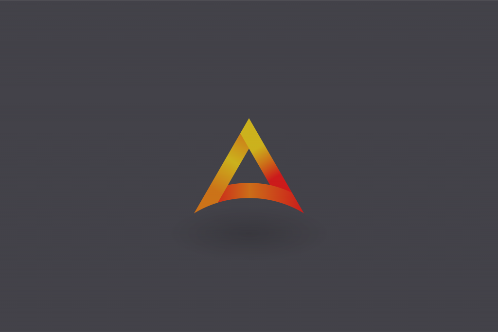
New to the consulting space, Agile Convergence wanted a unique and recognizable brand that could compete with industry leaders such as Agilest or Radtac. The result is an icon nicknamed ‘Peak’. This abstract triangle pays homage to Agile Convergence’s home in the Rocky Mountains, while doubling as a letter ‘A’ in its word mark. A minimalist logo at heart, this design touches on current trends with gradient depth and a flexible format. A color palette of warm analogous colors differentiates Agile Convergence from an industry rife with green, blue, and red. Balancing out this vibrancy is a complimentary dark grey with blue tint.
