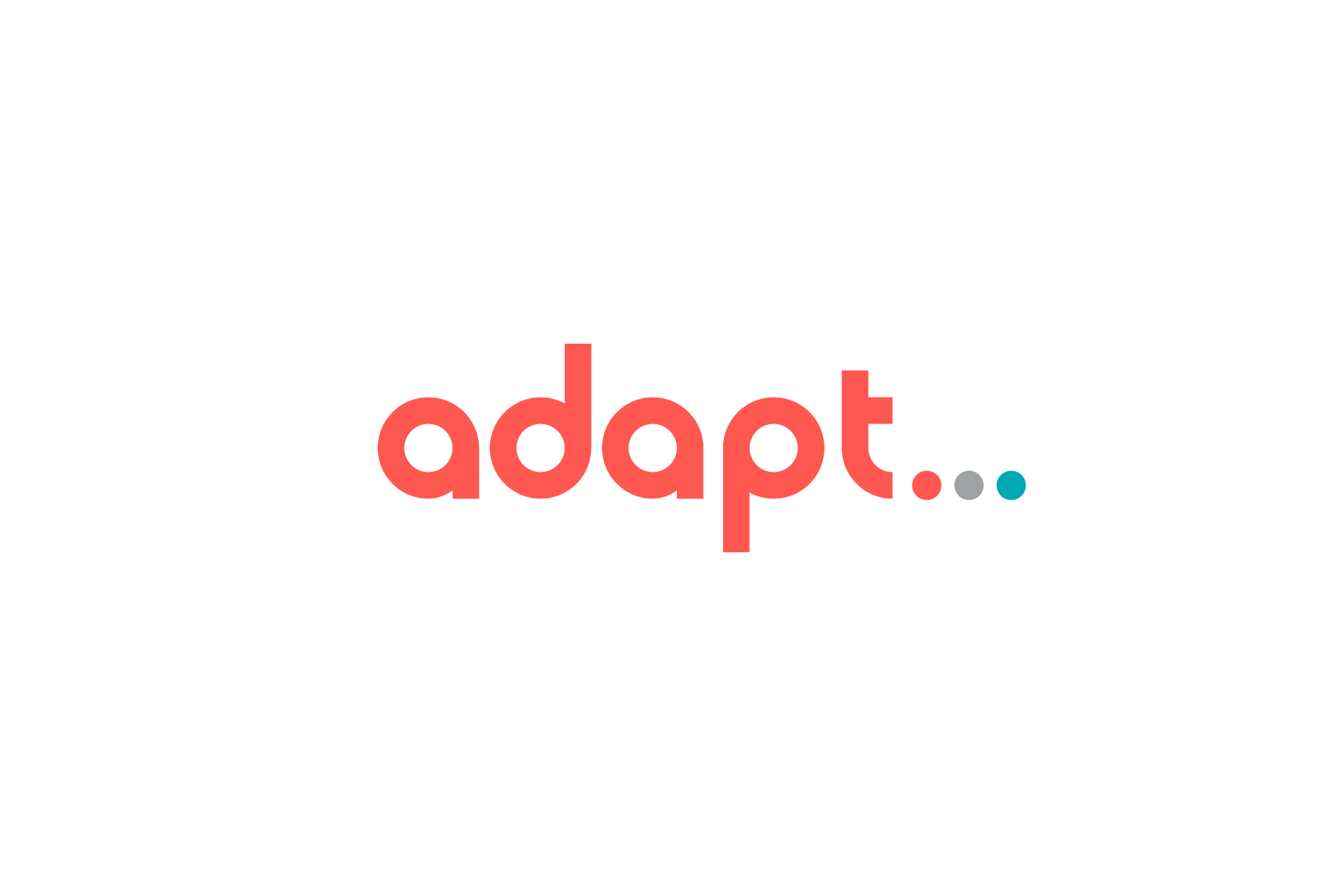
The solution for the Adapt Social wordmark and brand is quite unique.
Adapt is a social media marketing group that prides itself in staying up with changing trends. We communicated this with an ellipsis (…). This non-conventional design choice really sets Adapt apart from other brands.
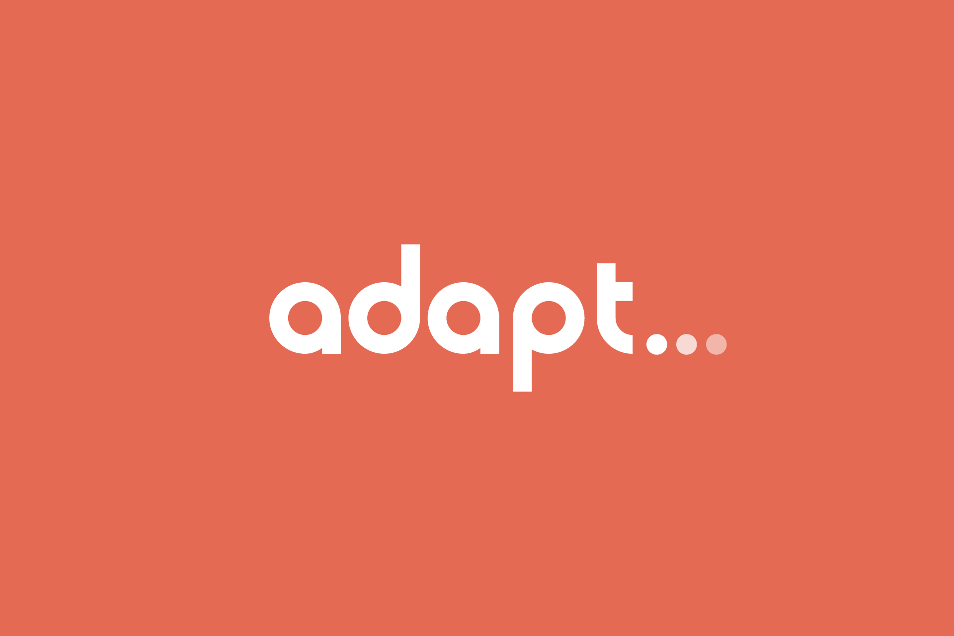
To further solidify the design, we created custom typography in somewhat of a Bauhaus style. Take note of the perfect circles within A, D, A, and P which also match our ellipsis symbol. A tail on the T borrows it’s shape from the previous letters while giving the ellipsis a clear starting point.
The final unique brand choice is color. With a client base mostly female, Adapt’s logo is leading off with a salmon (almost pink). A equally weighted blue gives us a second highlight, and a grey meets both colors in the middle. This concept is deployed on the ellipsis to give the perception of color changing from salmon to blue. A single tone version uses diminishing opacity to communicate the same effect.

