This week, I’m going behind the scenes with some of my favorite pieces from 2022. Sketches, unused concepts, and some forgotten design choices, they’re all here.
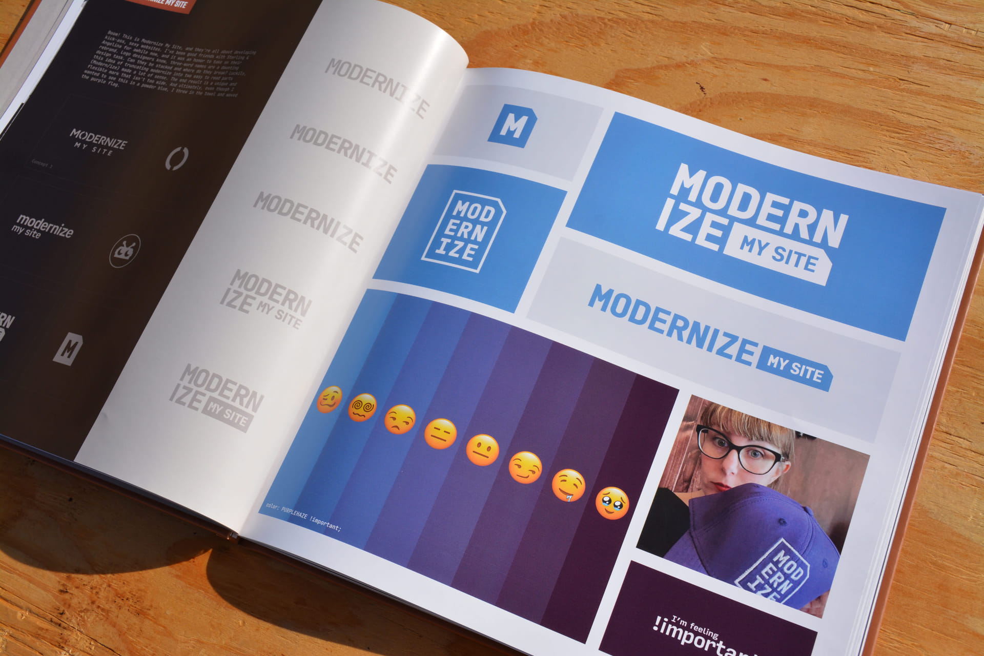
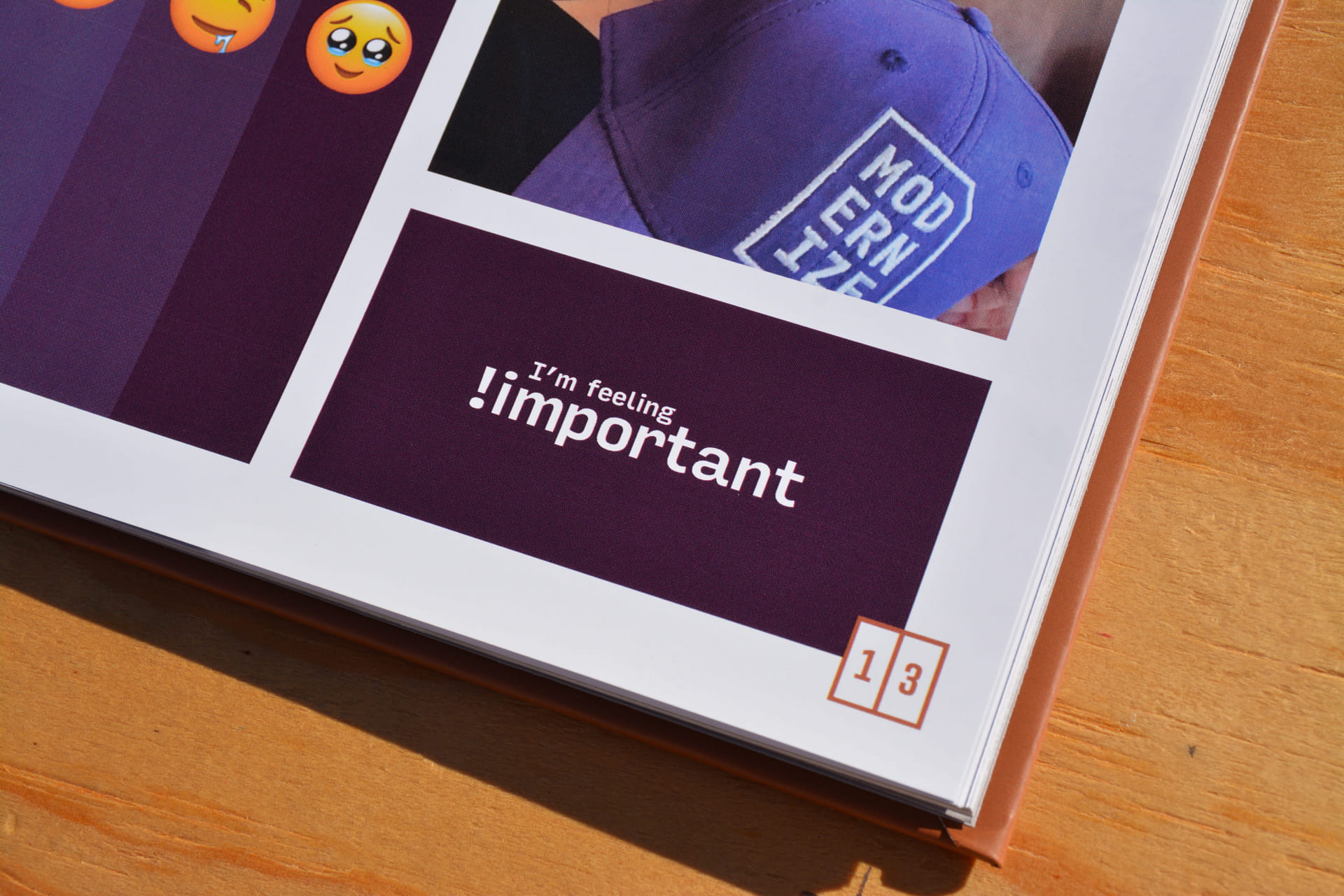
Next up is Modernize My Site, and they’re all about developing kick-ass, sexy websites.
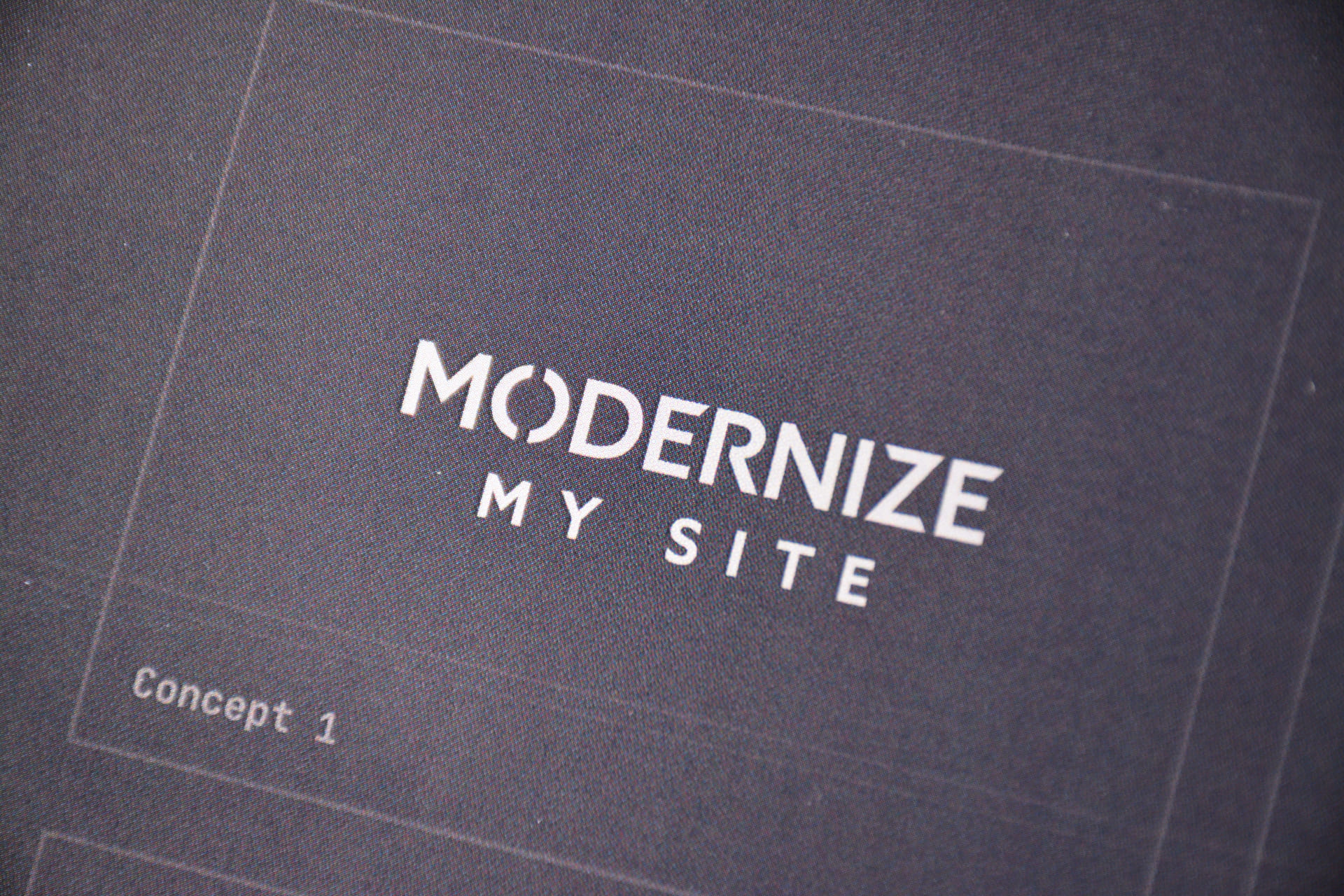
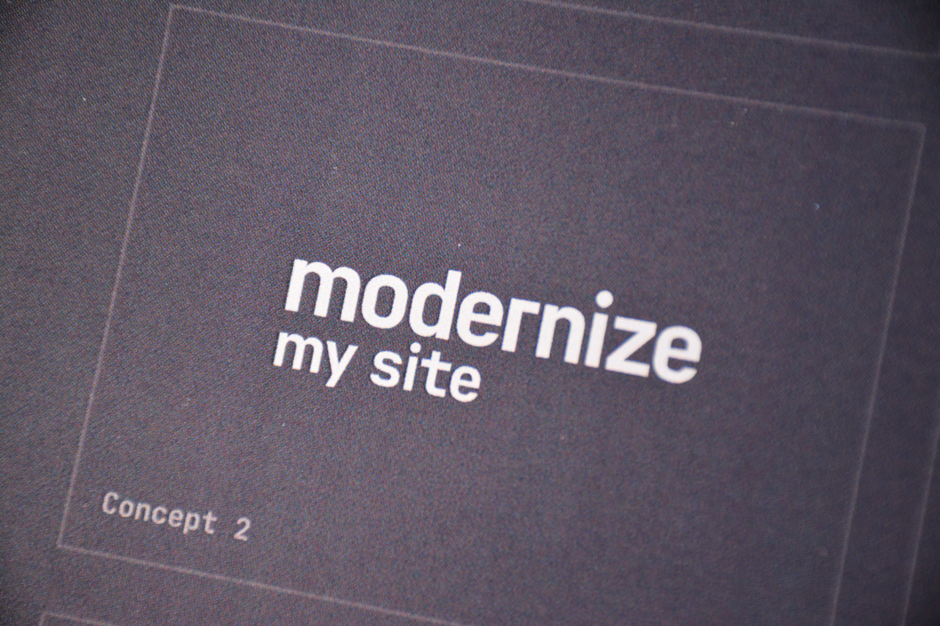
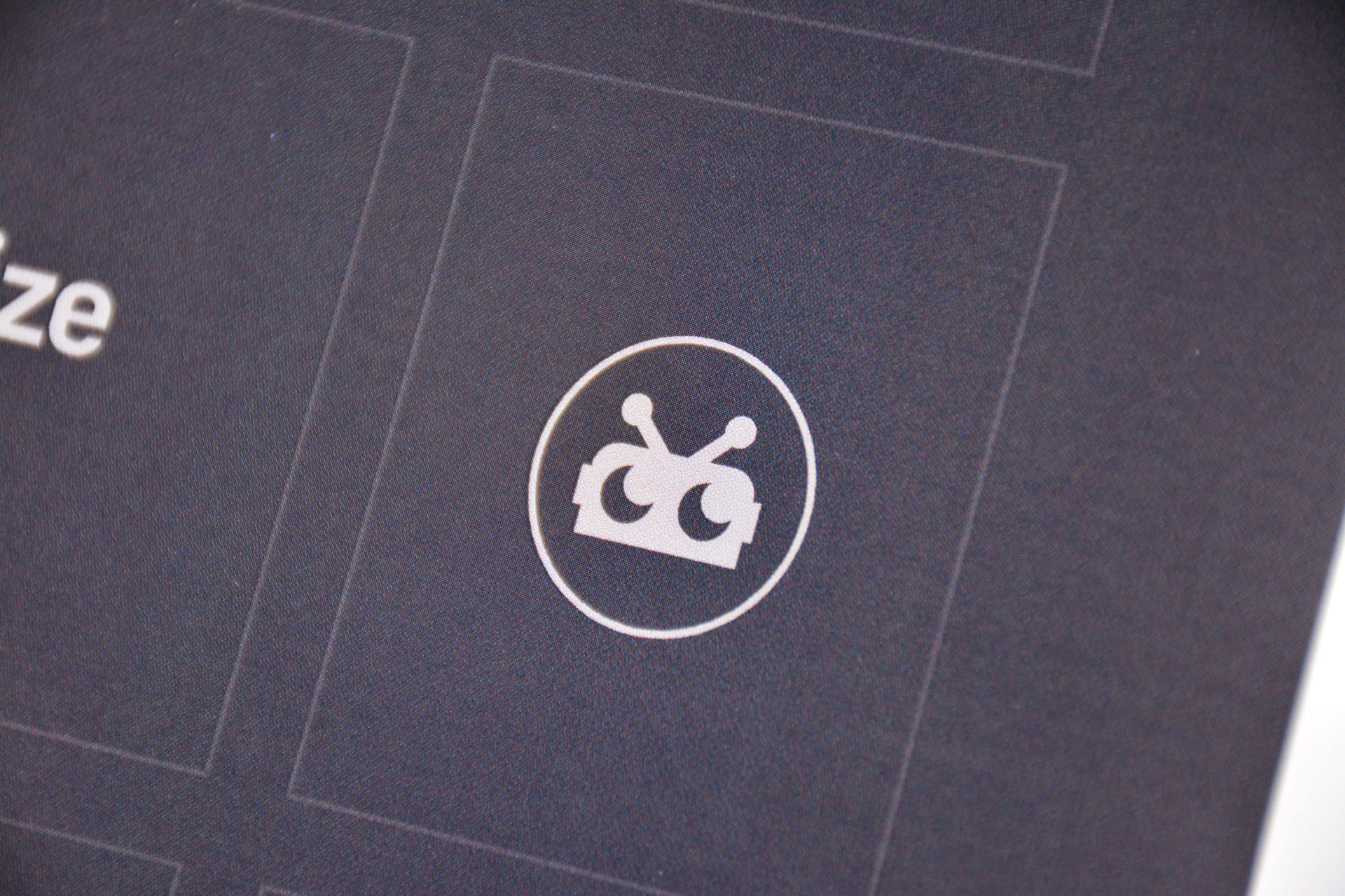
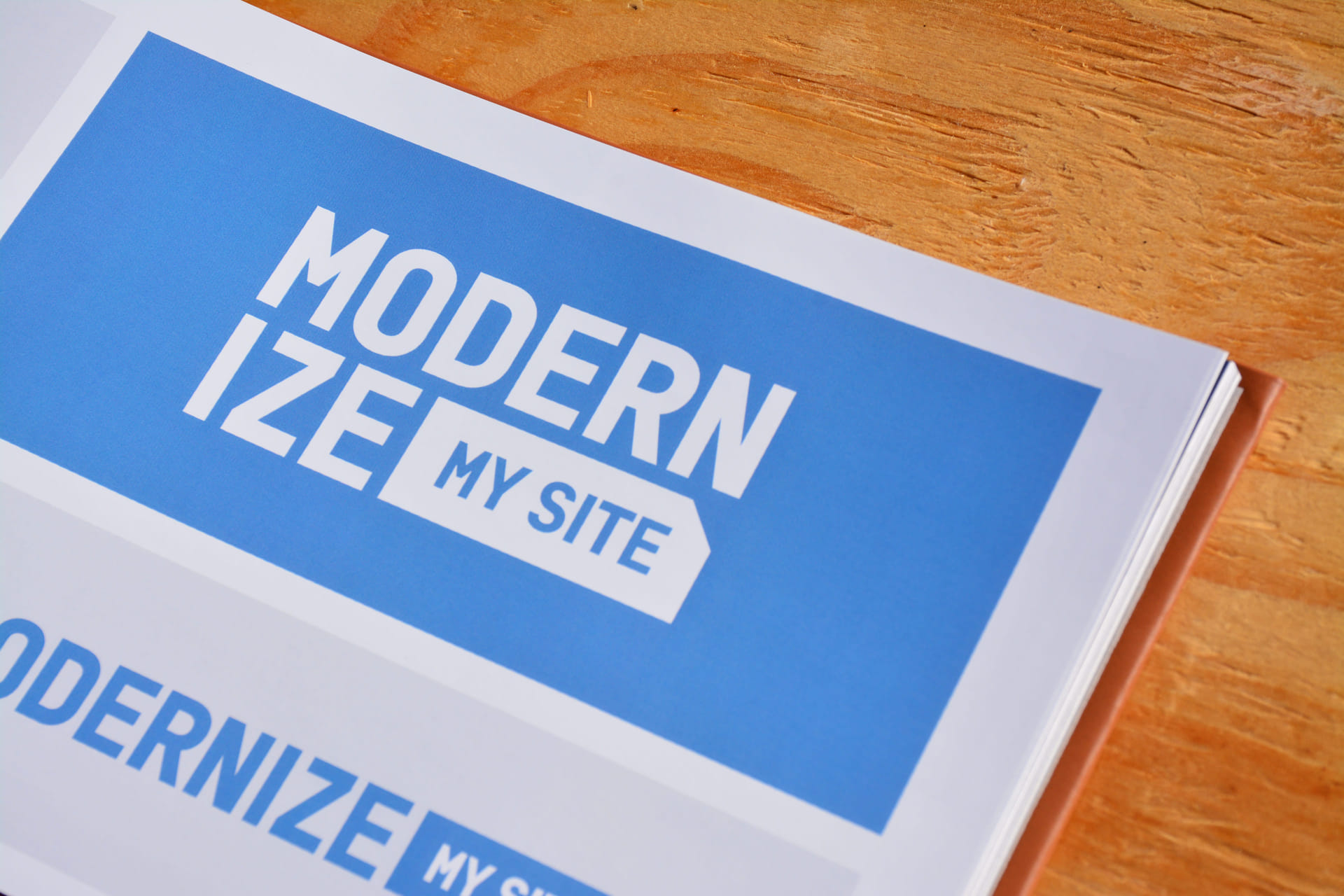
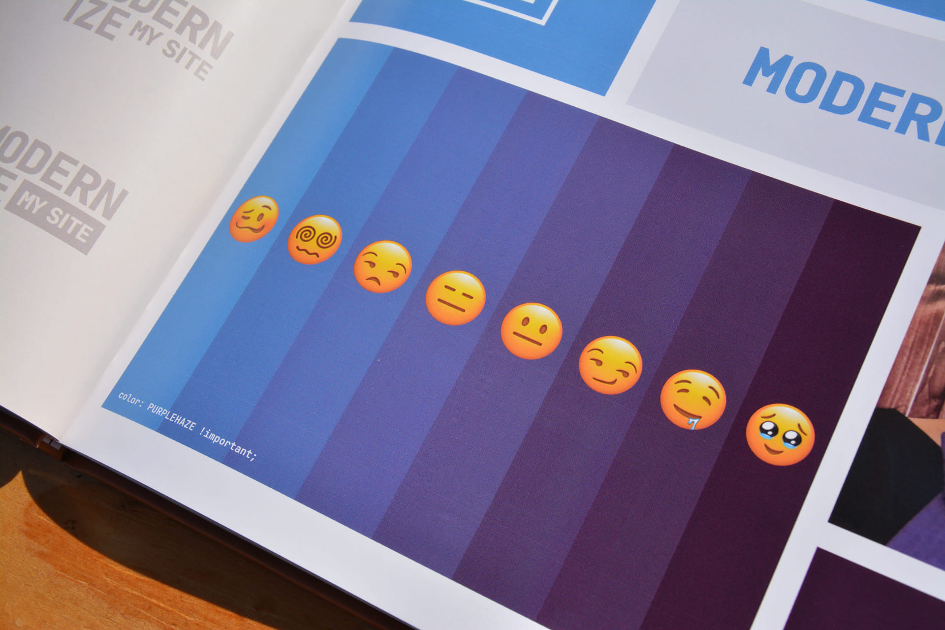
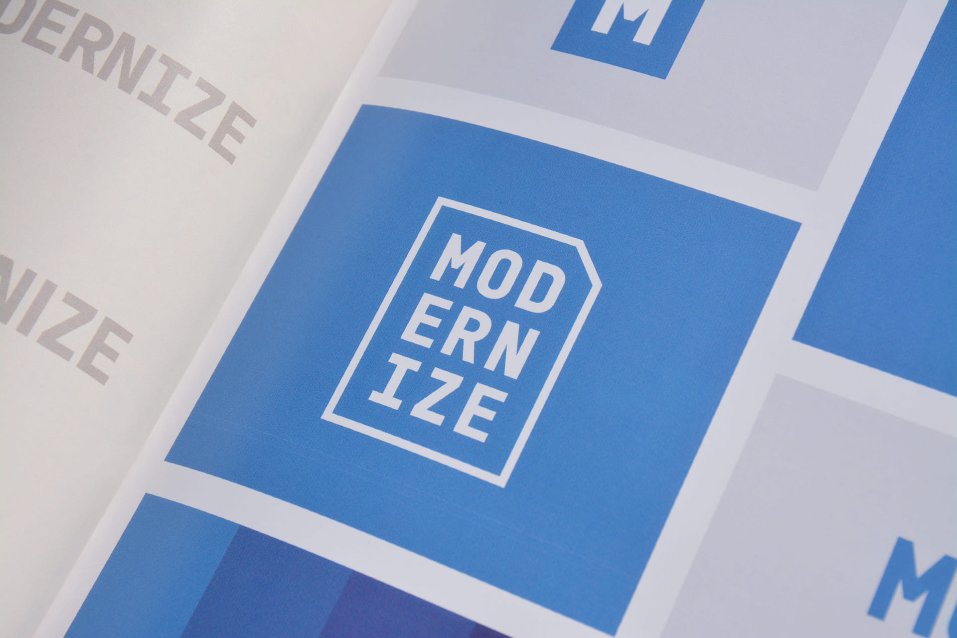
I’ve been good friends with Sterling & Angelina for awhile now, and it was an honor to take on their rebrand. Logo designers know, three-word names are a daunting design task. Can they be stacked and where do they break? Luckily, this idea of truncating modernize into two easy to read parts (Modern/ize) made a lot of sense. The end result is a unique and flexible mark that isn’t too wide. And ultimately, even though I wanted to see this in a powder blue, I threw in the towel and waved the purple flag.
